When it comes to “good” event photography, it’s a misconception that a given photo is representative of the entire event condensed down to a few well-framed shots. My process is both equal and opposite: to mislead the viewer into believing a few highly manipulated fleeting moments reflect the larger context by pleasing the eye with consciously undetectable lies. Flat-out, bold-faced, deception.
Photography is about contorting perceptions of reality. We want to believe the handful of infinitesimally small glorious moments at our weddings, birthdays and holidays represent the way people felt the entire time, when they really only capture less than 1% of the entire event. Don’t believe me? Watch a wedding video. The whole thing. Booooooring. No one really cares about the 45 minute toast or 15 minute car processional out of the parking lot. We do care, however, about the idea of the toast and vehicle processional and enjoy remembering the initial excitement, just not the long tail of boredom. You, as a photographer, thus have tremendous power to influence others perception of events if you teach your camera to lie.
For example, take this photo..
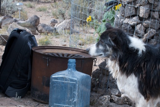
Yuck. It’s your typical crap run-of-the-mill shot you’d see on flickr, and I don’t feel anything special when I view it. It’s true to reality, which isn’t interesting. Now take this next shot…
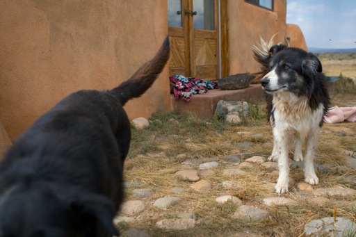
Not fine art, but much better: not because the situation or environment changed, but because we’ve lied about several things..
Movement. Look closely for “lines” formed by different objects in the first shot. It’s a chaotic mesh wherein the eye does know what to focus on. I don’t know what I should be looking at so my eyes are jumping all over the place. Am I supposed to be looking at the water jug? ..the dog? I have no idea. But in the second shot, notice how the diagonal line formed by the bottom of the house and the ground is mimicked by the step up to the door; by the dogs front feet; by the direction the dog is looking and moving; by the orientation of the two dogs. The movement of the entire shot eminates from the top right corner and radiates outward towards the other three. I know what I should be looking at and feel like something is happening because we’re created artificial movement.
White balance. The first photo is fairly accurate in terms of of the ambient light quality. The light was slightly bluish, which also happened to match the physical temperature of being very cold. But I don’t want you to feel cold. I want you to feel warm and fuzzy and giddy about the purdy doggy. The second shot feels warm, like a bright, sunny summer day, even though it was nearly freezing and about to rain.
Color. We’re pushed the saturation levels in the second shot to the extreme, but not quite so far as to detect our fib. Skies are not this blue, grass not this yellow/green, and adobe not this orange. Notice how every object has a distinct complementary color theme which is not intruded upon, as well as the exclusion of purple and red in the central theme.
Framing and cropping. By removing unnecessary distractions, we’re left with only the photos core concept to dwell upon. The negative space of the barren wall, sky and ground have distinct textures but are mostly devoid of objects which would steal our focus from the subject. We’ve tried to frame the dogs according to the rule of thirds, and all unnecessary concepts which could have been removed in the moment, have been.
Conclusion
Good photos are in the eye, not the technology, so you should strive to get great images straight out of the camera rather than rely on post-processing as a crutch. All of these concepts can be executed on a modern SLR and often only require post-processing for fine tuning.
Extra Credit Update! Spot the lie in this photo. (Hint: there’s an object in the room which shouldn’t be there!)

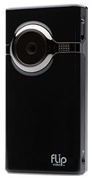


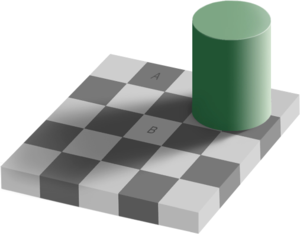 Perhaps my most interesting discovery of late is the