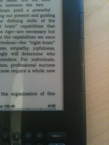
I’ve previously expressed my love for the Kindle family of devices, and on a whim decided to upgrade from the Kindle 2 to the new Kindle 3G with 3G and wifi. For others contemplating the upgrade, here’s what you need to know:
Pros
- The new button layout is way better. Next/Previous button are on both sides of the screen, and Home and Menu buttons have been moved to the keyboard area, along with a new direction pad (“d-pad”) design that is easier to use, albeit different.
- Smaller device footprint. Kindle 3 feels more compact and portable than Kindle 2.
- The screen update time is noticibly better, but only slightly so. It’s definitely noticable and a welcome improvement, but don’t expect LCD-level performance here. It’s still e-ink.
- Wifi! Not that on the more expensive model, you have both wifi support as well as the free 3G access.
Cons

- $189 for a bunch of marginal upgrades is a tough sell.
- Keyboard is still ghetto. It feels like typing on a 1990’s scientific calculator.
- The Next/Previous buttons depress easier than before, but they’re also smaller and don’t have any nubs to identify the button by touch. This seems stupid.
- Sharper screen. It’s a subtle improvement, but definitely feels crisper.
Recommendations
- New users should go for it, and light readers should be perfectly fine with the Wifi-only $139 model.
- Existing users with heavy usage patterns (at least an hour a day on average) should go for it. You’ll love the small speed improvements when highlighting and flipping pages.
- Existing Kindle 2 owners with light usage patterns should skip this revision. Future models will certainly see further improvements and lower costs.


