Categories
business computer personal Uncategorized

Textbooks: What Publishers Don’t Understand About The Internet

The Kindle 3G + Wifi eBook Reader

Textbook publishers in 2011 still aren’t fully appreciating the impact the Internet will have on their industry. A reasonably forward-thinking individual might optimistically assume the industry is self-correcting towards the wants and needs of consumers, but that doesn’t seem to be the case. Let’s explore:

Electronic typesetting.

Physical textbooks obviously can’t be reissued every time a typo is corrected. That’s fine, so we can keep making large textbook changes via en-mass “editions” to save typesetting efforts.

But electronic textbooks have many not-so-obvious differences.

  1. Screen sizes of reader hardware/software vary dramatically.
  2. Even if screen sizes were the same, it is of tremendous value to allow the user to change font and text size.
  3. Some screens support color, while other don’t. A wonderful color graphic may appear a blobby mess on a monochrome reader.
  4. The concept of a “page” no longer exists, due to #1 and #2, above. Content cannot simply say “See page 32.” References must be dynamic links, instead.
  5. Content can (and should be) linkable. Obvious examples are tables of contents and figure references. External links need to be supported, as well as more sophisticated “interactive” embedded content items. (A mathematics textbook with an exercise that asks, “Y = 3X + 2. Calculate Y for the following X values: 0, 4, 5.7.” should also grade the assignment as well. Why do I need a completely different book for this?)
  6. Searching, highlighting, note taking, and content sharing are all critical “must have” features for electronic texts.
  7. Open data interchange is probably the biggest techno-political challenge. Retailers aren’t yet jumping on the opportunity to exchange data with the competition. (But they will need to conceed because it’s what the consumers and publishers will want.)
Adobe's portable document format is a dying beast, as is Adobe itself. PDFs just doesn't work well for textbooks.

For all these reasons, please stop calling your PDF renderings “eBooks” and then calling it a day. PDF documents cannot “reflow” the way a web page does, and make reading extremely awkward because of reasons #1 and #2, above. In short, direct PDF conversions–such as those used by the University of Phoenix–don’t have any of the typesetting considerations or functional niceties of modern electron book formats, and should be avoided. Schools need to stop accepting cheap “Print To PDF”-style textbooks, as well as “eBooks” that can only be read through a web browser using special software that doesn’t support any of the above features. If your eBook implementation is less powerful than a physical book, you’re doing it wrong. Please improve!

Separation of form and content.

Typesetting concerns do not mean all is lost. If anything, it’s a wonderful opportunity to make revolutionary steps in improving the way written knowledge in transferred. As we’ve learned from the web, it’s entirely possible to design for dynamic layouts given you can make at least a few constraints.

Physical textbook typesetting needs to be optimized for a specific target. Electronic typesetting needs to optimize for overall good layout within a range of constraints. Web applications can generate multiple document types for the same content, and with such nimble requirements for electronic media, we can do the same with updated forms of typesetting languages like LaTeX.

eBooks don’t require a local sales representative.

It’s nice, I suppose, to have a rep on call to overnight you a textbook on a moments notice, but that’s not necessary when I can click a button on my iPad. The issue here is misaligned incentives in the payment of distributors.

Doesn't get where this whole Internet thing is headed.

To use a real-world example, my local Pearson rep seems to earn commissions on physical textbook sales to my classes, but not electronic copies sold through Pearson affiliate (or subsidiary?) CourseSmart. She’s always happy to help when I’m interested in buying paper, but suddenly goes unresponsive when I have a tangential question about an electronic book.

It’s not her job to help with online sales. That’s an entirely different business unit or whatever, so who cares about that, right? Here are some great properties of CourseSmart, Pearson’s chosen eBook sales system:

  • You can only access your electronic textbook for about 6 months. That’s right, you don’t own it. You’re essentially renting it for the semester.
  • The pricing is pretty high, especially considering you can often sell back physical books after the semester. You always get $0 after the rental period. Savings? Please.
  • You can’t really do anything neat with the electronic version, like download a simple effing PDF, even if you’re a legitimate, verified instructor that can already download content such as instructor solutions manuals and slides. (They don’t trust us. Trust me on that.)
  • Pearson and college sales/support infrastructure and personal incentives aren’t (yet) set up to fluidly handle electronic texts.
The Pragmatic Programmers offer DRM-free, reasonably priced technical books. Check 'em out!

In short, CourseSmart sucks. I thought it was going to be cheaper, simpler and generally better for students to use the electronic versions, but given the high cost “rent”-like nature and lack of features, it’s not great. Personally I’m looking to switch to publishers that understand ebook-oriented use cases and build their product to fully take advantage of the Internet, rather than just go through the motions. PragProg is a great example of a technical publisher that’s moving us in the right direction. (I send them a lot of business and highly recommend you check them out, too!)

I have to believe that the profit margins on selling an 800-page textbook as a $60 “online view only for 6 months only” product are greater than a $100 hunk of tree, especially considering the expenses of transporting, retailing, and commissioning (or marking up) every step. I suppose many of those people don’t want to go electronic due to fear of job loss, even though the jobs may simply change, instead.

Fast release cycles.

With properly designed exchange formats, textbooks and metadata can be pushed and pulled between publisher, retailer and consumer in under a second. The concept of “this years edition” starts to lose meaning if the publisher can fix a typo and push out a new revision with no more effort than updating a wiki page. This posses serious technological challenges with ISBNs, Library of Congress records etc., but all these things all fixable, and none of the solutions have anything to do with building a new PDF that gets emailed to me. (Even Amazon doesn’t do this right yet, even with their .azw format. When you agree to receive an optional update of a book you’ve purchased from Amazon, you lose all your notes and highlights from the original version. Lame.)

We need to embrace this idea of rapid content change, rather than cling to the idea of annual product releases. We can do it. Really.

Closing thoughts.

All the players in the textbook industry have different incentive systems, but all have much to gain. Rather than using the friendly neighborhood college bookstore as a primary retail outlet, the supply chain process… no, the entire industry, needs a comprehensive dose of cold water to the face. All is not lost, but in 2011? They still don’t get it.
Categories
computer personal

Amazon Kindle 2 Review

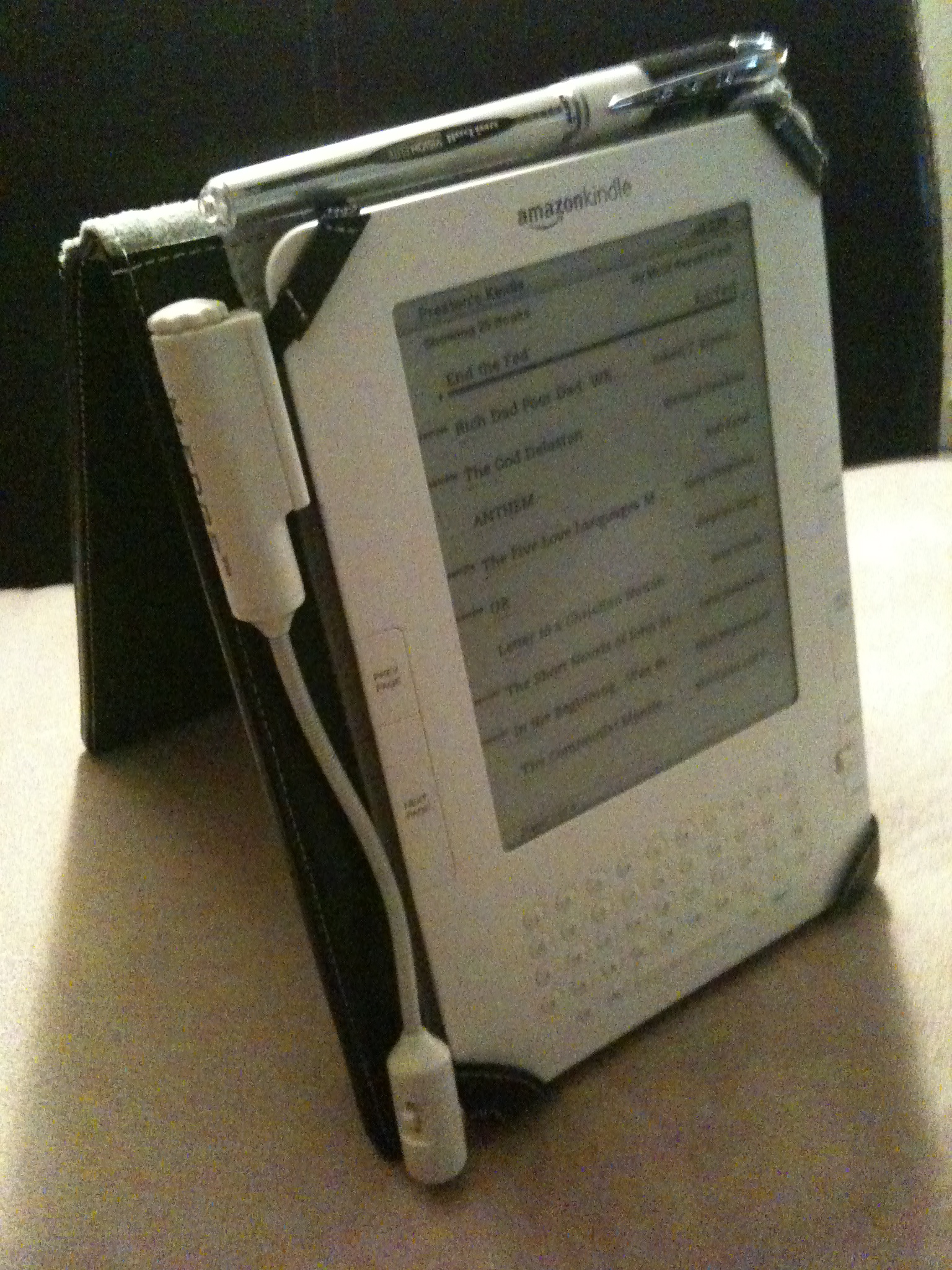
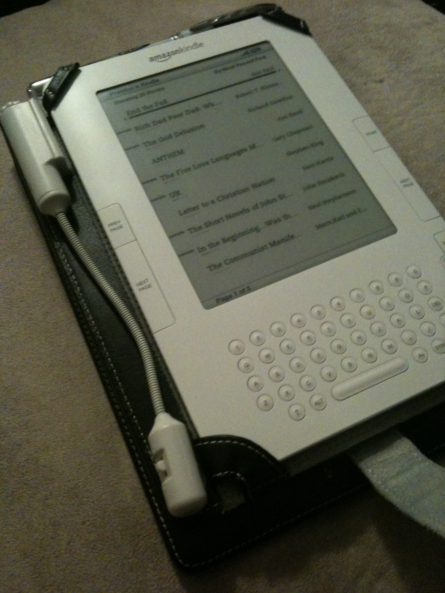
Kindle 2 with M-Edge Leather Platform Jacket and optional e-Luminator 2 book light.

The Kindle 2 is my first commitment to electronic books and e-ink screen. I silently waited until several generations of eBook readers were on the market–including the Barnes & Noble Nook–before making the decision to commit to Amazon’s Kindle 2.

Physical Interface

The 6″ e-ink display that looks just like the paper of a novel you’d buy at the grocery store. Unlike computer LCD displays, the Kindle’s screen is reflective, making it easier you to read outside in natural sunlight, just like a real book.

The built-in keyboard is extremely useful, though a tad clunky feeling. It is built with physical buttons (as opposed to “soft” or “virtual” buttons used on devices like the iPhone), and takes some getting used to, especially when searching a book and navigating a variety of different screens and dialogs. Despite a bit of awkwardness that is difficult to verbalize, it’s invaluable to have these controls, especially for searching and note taking.

Internet
One of the coolest features is the built-in 3G cellular radio that is tightly integrated with the Kindle Store and works similarly to the “One-Click Checkout” feature offered by Amazon. You can usually download a sample chapter before purchasing, and of course “upgrading” from samples to full copies is very straightforward and easy.

For individual subscription charges you may also subscribe to a gamut of periodicals and blogs. While it may seem strange to offer paid subscriptions to content you can often view for free online, the Kindle versions of the content are repackaged to support the navigational structure and user interface of the physical devices, provided a more fluid experience when bouncing between your regular reading material.

Using the built-in keyboard and 4-way joystick-like device, you can even use a built-in web browser to surf the internet in a bind. Surprisingly, there are no monthly services charges for this ability, though the device clearly is not designed for web surfing. Even with free 3G service you’ll usually use your phone, laptop etc. instead.

Formats

All purchases (including subscriptions) are automatically delivered wireless to your Kindle. I’ve generally found Amazon’s “delivered in less than 60 seconds” claim to be true: even when cruising through a barren Nevada desert.

You have the ability to read your own .PDF, .TXT, .MOBI, .DOC and other documents, and are provided a free service to convert your documents to the Kindle’s native .AZW format. Note, however, that .PDF files, while displayed, cannot be re-layed out to fit the size and orientation of the screen. Constantly having to zoom in and out is annoying, so you’ll often want to convert to .AZW before transferring content to your Kindle.

Synchronization

At time of this writing, Kindle content can be managed and accecssed in four ways, the…

  • Kindle itself.
  • Kindle website.
  • Free iPhone application.
  • Free PC application.

Content purchased using the Kindle Store–via any of these interface–can freely sync amongst them, assuming they are all tied to the same Amazon account. After a piece of content is purchased, it is automatically backed up on Amazon’s servers, allowing you to delete it from the device today and easily restore it (even to a different device) sometime in the future.

Note that documents you load onto the Kindle (via a USB connection to your Mac or PC, or wirelessly for a nominal charge) will not be backed up to Amazon’s systems, nor can they be automatically synced between interfaces. It would be fabulous to have Amazon back up my own Kindle content, though since it wasn’t purchased from Amazon it seems reasonable to not offer this service. (Note to Amazon: I would pay for this feature!)

Audio

Kindle 2 with M-Edge Leather Platform Jacket and optional e-Luminator 2 book light.

The text-to-voice software turns out to be surprisingly useful. Some words, as you would expect, are consistently mispronounced and a tad distracting, but not so much as to detract from its use. Using both the built-in headphone and built-in speakers, you’ll find yourself being read to in the car, walking around campus, the grocery store.. pretty much anyway you’d normally listen to music. Mispronounced words that are a tad annoying:

  • “idea”. It is being pronounced EYE-DEE-AYE.
  • “live” as in “alive“. It is always being pronounced as in “olive“.
  • Some abbreviations that look like Roman numerals. I’m sure this is a hard one to fix, but it’s nevertheless distracting to have the sentence, “I was at the IV [pronounced EYE-VEE] office yesterday.”, but hear “I was at the ONE-FIVE office yesterday.”

There is also an “experimental” MP3 player built in. It is in no way even comparable to the interface or features provided by iPods, but nevertheless a “nice to have” feature. I use it rarely since I already carry around an iPhone and use iTunes for media management.

Additional Software Features

Online access to bookmarks, highlights and notes of purchased books.

Things you won’t be able to live without once you get used to them:

  • Search. One of my biggest issues with traditional, printed texts is the lack of a trivial way to search them. On the Kindle, you just start typing and hit the enter key. What’s even better is that you can easily switch the search index from the current book to sites like Wikipedia.
  • Built-in dictionary. Just position the cursor before a term, and a small footnote will appear on the bottom of the screen. (Anecdote: I just found myself physically poking a word in 10-pound textbook, as if some dialog were to materialize in the air above. As I chuckled to myself I realized that I was now addicted to eBooks, and was unlikely to ever go back.)
  • Bookmarking. The concept of a “bookmark” is only slightly different than in the physical world. Since content in the electronic world is usually defined separately from it’s presentation, layout is based on personal preference (bigger vs. smaller text), screen size (Kindle 2 vs. the larger Kindle DX), font (Helvetica vs. Arial), orientation (portrait vs. landscape), and numerous other factors. This make the concept of a “page” obsolete, because chapter 3 of a new book may appear on page 47 for one person and 32 for another. Instead, we now have “locations”, which assign a sentence or paragraph a number that can be looked up regardless of how the content gets layout out.
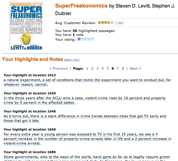
  • Notes.  If you like to “write in the margins” of traditional books, you can do effectively the same thing on the Kindle. Just move the cursor to wherever you want your note, click the directional-pad button, type your note, and then click the button again. You’ll now see a handy interactive superscript symbol at the insertion point. These notes also get written to a plain text file that can be read when the Kindle is plugged in via USB, at “documents/My Clippings.txt”
  • Highlighting. I love taking a bright yellow highlighter to a good non-fiction book. You can not only do effectively the same thing on the Kindle, but this metadata also becomes saved in a new file that is synced back to Amazon’s servers, allowing you to easily browse your highlights, notes and bookmarks via the web, even without your Kindle handy.

Cons

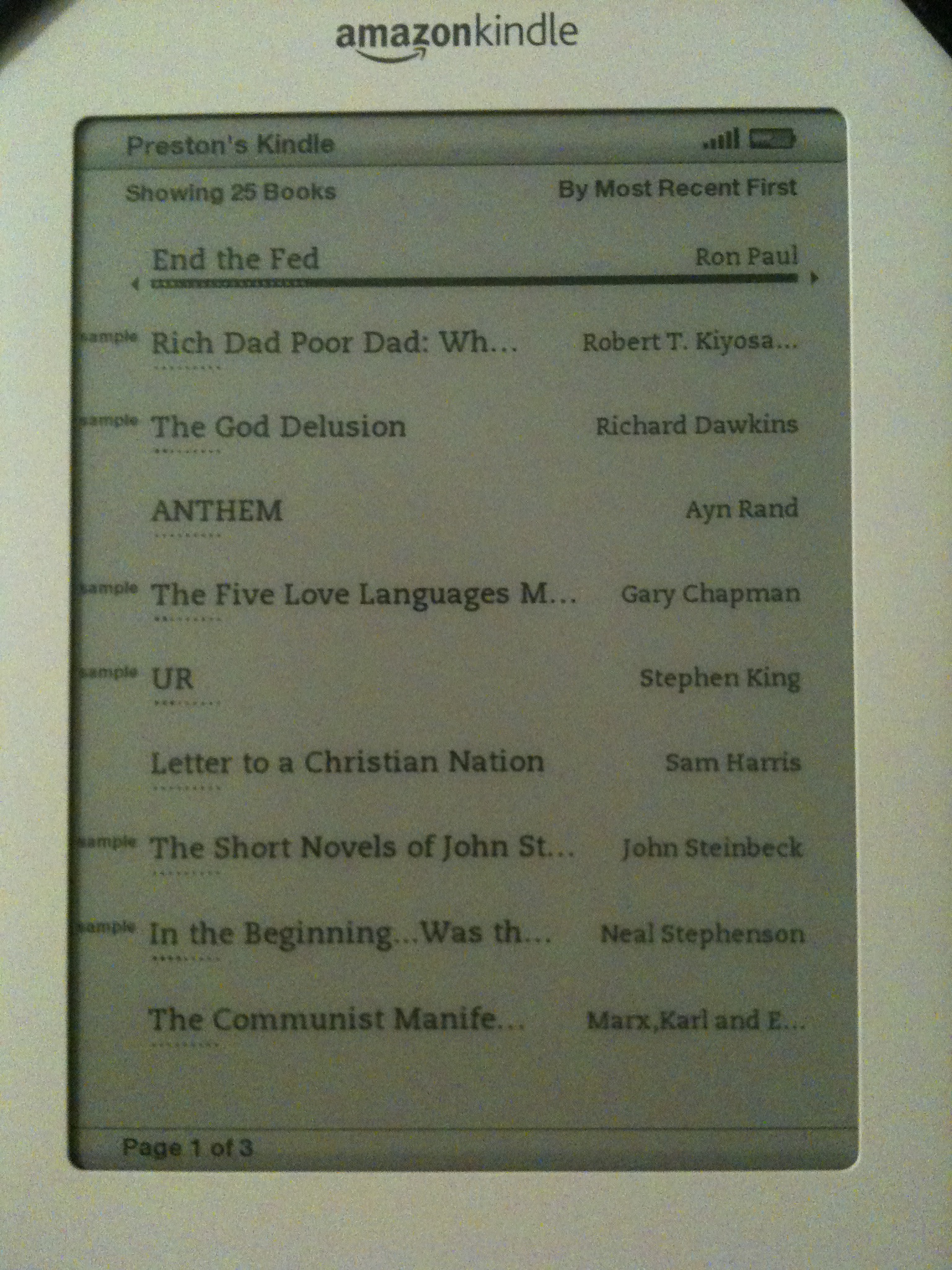
Home screen of the Kindle 2. Displayed: several purchased books and a variety of "samples" from the Kindle Store.
  • Purchased are DRM’d, and cannot (yet) be shared. I waited until the release of the Nook to make a purchasing decision because of B&N’s claim that you would be able to “loan” purchased content to friends, but the feature is, in my opinion, way too restrictive to be a prime selling point.
  • Software feels clunky, especially for someone accustomed to lots of intuitive Apple-designed GUIs. 🙂
  • Screen is slow to update, though none of the other readers on the market seem to be noticeably better.
  • Does not come with a case.
  • Keyboard could be much better.

Conclusion

While not without its flaws–most notably slowness of the screen to update–I love the Kindle and keep it with me whenever possible. For me, the Kindle is more than just a gadget. It represents a fundamental change in the way I interact with written knowledge, and resets my expectation accordingly. I fully expect large-scale consumer transition to e-ink-style display to be rocky due to nasty web of vendors, publishers and authors all vying to dominate the market early, but for the avid readers out there, it’s worth it.