Categories
computer personal

Preston And AT&T Give Each Other The Finger

I made the jump the last day before Verizon stopped offering unlimited data plans. The delay for switching to Verizon was not lack of motivation–AT&T service has always paled to Verizon in Arizona and is nearly nonexistent at my summer home–but in desperate procrastination of dealing with the migration process. My longest conversation (highly abbreviated) with AT&T on the matter took about an hour and was so traumatizing that I can’t see myself ever returning. As far as I’m concerned AT&T is dead and buried:
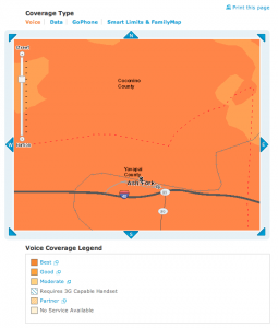
Coverage map showing AT&T's miraculous ability to provide "Best" service without operational towers.


Me: I’m not happy with my AT&T service and would like to cancel my service plan.

Customer Service Representative: I’m sorry to hear that, sir. May I ask why?

Me: I’m in an area with about 1-bar service about half the time, no 3G data (EDGE only), and constant dropped calls. I’m not really getting “service” per se.

Rep: I’m very sorry to hear that. We can cancel your plan for $<huge fee>.

Me: Well… I really don’t think that’s entirely fair. The issue isn’t really that I don’t WANT service, but AT&T isn’t providing what I’m already paying for. I’m paying about $100/month for unlimited 3G data, <list of other features>, and I only get a few of them some of the time. Check the coverage map.

Rep: Yes, sir! I can see you live in a “Best Coverage” area. That is very good!

Me: 1-bar signal 50% of the time, no 3G and dropped calls the other 50% is “Best Coverage”?

Rep: The map shows we have multiple towers in the area! You should be getting great service according to the map.

Me: I understand what the map says; I’ve seen it many times, trust me. The issue is not just me, though. No one else with AT&T seems to get usable service here, either.

Rep: I’m very sorry to hear that, sir. One of the towers is not operational. That may have something to do with it. Would you like us to send out an engineer to test your hardware?

Me: Wait… what? First, my hardware is fine. It works fine in <other cities with service>. No one else’s phone works well here on AT&T’s network, either. Second, if you’re dispatching an engineer wouldn’t it make sense to fix the tower instead? …You know, the NOT OPERATIONAL one that is currently providing “Best Coverage”?

Rep: Unfortunately we cannot do that, sir.

Me: It doesn’t make sense to charge me for a service you just admitted you can’t provide. I understand I’m under contract and don’t dispute that, but AT&T has obligations, too, and if AT&T can’t meet them it isn’t right to punish the customer.

Rep: Unfortunately, sir, it is your fault for choosing to live in an area without good service coverage.

Me: ARE YOU FUCKING SERIOUS??? I checked your goddamn map before, during and after moving here, and the fucking thing says “BEST COVERAGE” despite having a non-operational tower. I’ve been here for some time now and it’s never been any better.

Rep: Yes, sir! Coverage in that area is strong. Would you like us to send out an engineering to test your equipment?

Me: YOU JUST SAID A TOWER IS NOT OPERATIONAL. SOME GUY WAIVING MY PHONE TO THE SKY IS NOT GOING TO MAKE IT CONNECT TO A TOWER THAT DOESN’T WORK. DO YOU UNDERSTAND WHAT THE FUCK A CELL TOWER DOES?

Rep: Like I said, sir, it is AT&T’s policy to charge cancellation fees according to your contract. We cannot even consider overriding them in such a strong service area.

Me: <Infuriated abrupt disconnect.>

So, I’m now staring at a ridiculous cancelation bill. On the bright side, though, I sold my old AT&T iPhone the next week via eBay for over $200, which not only covered the new Verizon hardware cost but activation fees as well. I’m not getting great 4G on my Mifi (which was disclosed though), but at least I’m getting ok 3G and voice service on my iPhone for about the same price. AT&T? Please.

Categories
business computer personal Uncategorized

Textbooks: What Publishers Don’t Understand About The Internet

The Kindle 3G + Wifi eBook Reader

Textbook publishers in 2011 still aren’t fully appreciating the impact the Internet will have on their industry. A reasonably forward-thinking individual might optimistically assume the industry is self-correcting towards the wants and needs of consumers, but that doesn’t seem to be the case. Let’s explore:

Electronic typesetting.

Physical textbooks obviously can’t be reissued every time a typo is corrected. That’s fine, so we can keep making large textbook changes via en-mass “editions” to save typesetting efforts.

But electronic textbooks have many not-so-obvious differences.

  1. Screen sizes of reader hardware/software vary dramatically.
  2. Even if screen sizes were the same, it is of tremendous value to allow the user to change font and text size.
  3. Some screens support color, while other don’t. A wonderful color graphic may appear a blobby mess on a monochrome reader.
  4. The concept of a “page” no longer exists, due to #1 and #2, above. Content cannot simply say “See page 32.” References must be dynamic links, instead.
  5. Content can (and should be) linkable. Obvious examples are tables of contents and figure references. External links need to be supported, as well as more sophisticated “interactive” embedded content items. (A mathematics textbook with an exercise that asks, “Y = 3X + 2. Calculate Y for the following X values: 0, 4, 5.7.” should also grade the assignment as well. Why do I need a completely different book for this?)
  6. Searching, highlighting, note taking, and content sharing are all critical “must have” features for electronic texts.
  7. Open data interchange is probably the biggest techno-political challenge. Retailers aren’t yet jumping on the opportunity to exchange data with the competition. (But they will need to conceed because it’s what the consumers and publishers will want.)
Adobe's portable document format is a dying beast, as is Adobe itself. PDFs just doesn't work well for textbooks.

For all these reasons, please stop calling your PDF renderings “eBooks” and then calling it a day. PDF documents cannot “reflow” the way a web page does, and make reading extremely awkward because of reasons #1 and #2, above. In short, direct PDF conversions–such as those used by the University of Phoenix–don’t have any of the typesetting considerations or functional niceties of modern electron book formats, and should be avoided. Schools need to stop accepting cheap “Print To PDF”-style textbooks, as well as “eBooks” that can only be read through a web browser using special software that doesn’t support any of the above features. If your eBook implementation is less powerful than a physical book, you’re doing it wrong. Please improve!

Separation of form and content.

Typesetting concerns do not mean all is lost. If anything, it’s a wonderful opportunity to make revolutionary steps in improving the way written knowledge in transferred. As we’ve learned from the web, it’s entirely possible to design for dynamic layouts given you can make at least a few constraints.

Physical textbook typesetting needs to be optimized for a specific target. Electronic typesetting needs to optimize for overall good layout within a range of constraints. Web applications can generate multiple document types for the same content, and with such nimble requirements for electronic media, we can do the same with updated forms of typesetting languages like LaTeX.

eBooks don’t require a local sales representative.

It’s nice, I suppose, to have a rep on call to overnight you a textbook on a moments notice, but that’s not necessary when I can click a button on my iPad. The issue here is misaligned incentives in the payment of distributors.

Doesn't get where this whole Internet thing is headed.

To use a real-world example, my local Pearson rep seems to earn commissions on physical textbook sales to my classes, but not electronic copies sold through Pearson affiliate (or subsidiary?) CourseSmart. She’s always happy to help when I’m interested in buying paper, but suddenly goes unresponsive when I have a tangential question about an electronic book.

It’s not her job to help with online sales. That’s an entirely different business unit or whatever, so who cares about that, right? Here are some great properties of CourseSmart, Pearson’s chosen eBook sales system:

  • You can only access your electronic textbook for about 6 months. That’s right, you don’t own it. You’re essentially renting it for the semester.
  • The pricing is pretty high, especially considering you can often sell back physical books after the semester. You always get $0 after the rental period. Savings? Please.
  • You can’t really do anything neat with the electronic version, like download a simple effing PDF, even if you’re a legitimate, verified instructor that can already download content such as instructor solutions manuals and slides. (They don’t trust us. Trust me on that.)
  • Pearson and college sales/support infrastructure and personal incentives aren’t (yet) set up to fluidly handle electronic texts.
The Pragmatic Programmers offer DRM-free, reasonably priced technical books. Check 'em out!

In short, CourseSmart sucks. I thought it was going to be cheaper, simpler and generally better for students to use the electronic versions, but given the high cost “rent”-like nature and lack of features, it’s not great. Personally I’m looking to switch to publishers that understand ebook-oriented use cases and build their product to fully take advantage of the Internet, rather than just go through the motions. PragProg is a great example of a technical publisher that’s moving us in the right direction. (I send them a lot of business and highly recommend you check them out, too!)

I have to believe that the profit margins on selling an 800-page textbook as a $60 “online view only for 6 months only” product are greater than a $100 hunk of tree, especially considering the expenses of transporting, retailing, and commissioning (or marking up) every step. I suppose many of those people don’t want to go electronic due to fear of job loss, even though the jobs may simply change, instead.

Fast release cycles.

With properly designed exchange formats, textbooks and metadata can be pushed and pulled between publisher, retailer and consumer in under a second. The concept of “this years edition” starts to lose meaning if the publisher can fix a typo and push out a new revision with no more effort than updating a wiki page. This posses serious technological challenges with ISBNs, Library of Congress records etc., but all these things all fixable, and none of the solutions have anything to do with building a new PDF that gets emailed to me. (Even Amazon doesn’t do this right yet, even with their .azw format. When you agree to receive an optional update of a book you’ve purchased from Amazon, you lose all your notes and highlights from the original version. Lame.)

We need to embrace this idea of rapid content change, rather than cling to the idea of annual product releases. We can do it. Really.

Closing thoughts.

All the players in the textbook industry have different incentive systems, but all have much to gain. Rather than using the friendly neighborhood college bookstore as a primary retail outlet, the supply chain process… no, the entire industry, needs a comprehensive dose of cold water to the face. All is not lost, but in 2011? They still don’t get it.

Categories
personal

Kindle 3G Upgrade: Mini Review, Recommendations

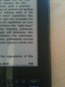
The "Home", "Menu" and "Back" buttons are now to the right of the keyboard.

I’ve previously expressed my love for the Kindle family of devices, and on a whim decided to upgrade from the Kindle 2 to the new Kindle 3G with 3G and wifi. For others contemplating the upgrade, here’s what you need to know:

Pros

  • The new button layout is way better. Next/Previous button are on both sides of the screen, and Home and Menu buttons have been moved to the keyboard area, along with a new direction pad (“d-pad”) design that is easier to use, albeit different.
  • Smaller device footprint. Kindle 3 feels more compact and portable than Kindle 2.
  • The screen update time is noticibly better, but only slightly so. It’s definitely noticable and a welcome improvement, but don’t expect LCD-level performance here. It’s still e-ink.
  • Wifi! Not that on the more expensive model, you have both wifi support as well as the free 3G access.

Cons

"Next" and "Previous" buttons are now on BOTH sides of the device. A welcome change!
  • $189 for a bunch of marginal upgrades is a tough sell.
  • Keyboard is still ghetto. It feels like typing on a 1990’s scientific calculator.
  • The Next/Previous buttons depress easier than before, but they’re also smaller and don’t have any nubs to identify the button by touch. This seems stupid.
  • Sharper screen. It’s a subtle improvement, but definitely feels crisper.

Recommendations

  • New users should go for it, and light readers should be perfectly fine with the Wifi-only $139 model.
  • Existing users with heavy usage patterns (at least an hour a day on average) should go for it. You’ll love the small speed improvements when highlighting and flipping pages.
  • Existing Kindle 2 owners with light usage patterns should skip this revision. Future models will certainly see further improvements and lower costs.
Categories
personal

South Korea Travel Tips For United States Travelers

Interesting tidbits on Seoul for United States travelers:

  • The food is generally awesome, though the beef sucks and is more expensive. If you decide to try American-style fast food, expect variations customized to the locale. (For example, the McDonalds I tried had “Bulgogi Burgers” as the #1 combo item. Interesting to try, but still McDonalds.) If you eat a lot of wheats and grains, expect to switch over to many more rice-based foods such as rice noodles, pastries, and plain old rice. Seriously … that’s just the culture and you’d be wise to just deal with it.
  • With a few excepts–most notably watermelon–fruits are generally not served often. Many native and healthy vegetables are frequently served cold with most meals, generally covered with regional spices. The kimchi (김치) is generally excellent, as you’d probably suspect. If you haven’t ever had it… well, you’ll have plenty. 🙂 It’s a huge cultural staple in Korea.
  • If you look white, people will generally do their best to speak English to you, if they can. If you look Korean, they’ll almost always speak Korean. The general rule of thumb is that the more a type of job makes, the more likely it is that the person will speak English. In other words, don’t expect English skills from store clerks and restaurant staff. For those people looking Japanese or Chinese I couldn’t discern any obvious prejudacies, though I’m very “white” looking and don’t speak the language so I could easily be missing obvious cues.
  • The subway system in Seoul is huge (as is Seoul itself with over 10 million people), and is akin to the systems in San Francisco, Chicago and New York. Most subway signs and ticketing machines have English, though announcements in Korean can be a little difficult to discern for native English speakers. I would advise at least learning the basics of the Korean alphabet (Hangul) and pronunciation rules so you at least sound out words only written in Korean, albeit extremely slowly and with a horrible accent.
  • WiFi connectivity in disappointingly similar to U.S. cities. That is, in urban areas it’s generally within range but paid hourly/daily (such as in hotels, Starbucks, coffee houses etc.), or if you’re lucky you’ll infrequently find a decent free open access point. It’s pretty much non-existent in rural areas.
  • Most sink faucet handle operate the reverse of U.S. handles to operate water flow. (In the U.S. you pull up or “lift” the handle to turn on the water, here you push down.)
  • Almost all places seem to have toilets available (as opposed to just squating over some sort of hole), so I wouldn’t worry about that. All respectable establishments seem to have toilets. Some have bidets.
  • For various cultural reasons, Koreans tend to be very clean, especially when it comes to floors. Remember to take your shoes off before entering peoples homes. Some restaurants will require you to do the same, particularly those here you sit on the floor, which makes sense.
Categories
personal

Book Review of DIY U: : Edupunks, Edupreneurs, and the Coming Transformation of Higher Education


Question: If I complete my general physics and mathematics studies using freely available MIT OpenCourseWare content on my own time, computer science study on campus at ASU Polytechnic, and general education requirements at UoP, all for a degree program at Berkeley, what’s wrong with that? After all, as long as I can demonstrate the competancies outlined in its program of study, isn’t this effectively more-or-less the equivalent of the Berkeley-delivered version costing possibly 10x more in total? Good for me… right? And if so, who cares?

Answer: Hundreds of years of authoritative people vetted in an aggrandizing aristocracy of exclusionary education. That’s who.

Universities best interests are not necessarily aligned with those of students, and as DIY U explores, the differences can be disheartening to the point of infuriating. Given a long-established tradition of prestigue through extreme selectivity and absurd financial requirements, it is understandable that many universities are struggling to find their way in the Information age.

I enjoy looking at political issues though numbers, statistics, historical analysis, and really any sort of empirical evidence lending insight to the world around us. With regards to education, it is obvious that we have yet to fully realize how Internet-enabled technologies fundamentally change how we should perceive learning, and due to the explosive growth of exploratory online systems it is critical we define realistic paths to evolve traditional, costly, centralized, campus-oriented, course-based university programs to the increasingly decentralized, affordable, online, multi-national, outcome-based demands being pushed by current generations of students. DIY U investigates this gap using historical evidence, anecdote, current statistics, and critical analysis: exactly the type of writing I look for in subject matter of high debate.

Of particular interest to me are the many statistics on past, current, and projected future costs of higher education. Not that this should be shocking, but the gist is that the current model just isn’t going to work if we really want to positively improve the general education level of the American population. (And I think the whole world would nod in violent support of this goal.) Simply using federal subsidies to (attempt to) expand an already antiquated model of education would be outright foolish.

I also particularly enjoyed the sections on different paradigms actively being used to varying degrees of success, specifically outcome and competency assessment-based learning. I’ve attended four higher-ed schools to date, and find the requirements of having to take specific course line numbers at a specific college for a specific degree program within a single university in the 21st century to be unacceptably, and quite literally, “old school”. As someone who’s said “I could have tested out of that class” numerous times, the concept makes sense to me.

If you find these topics interesting, by all means pick up copy of DIY U: Edupunks, Edupreneurs, and the Coming Transformation of Higher Education. I purchased my Kindle version for about $10 on Amazon.

Categories
business computer

Mini-Review: Meltdown: A Free-Market Look at Why the Stock Market Collapsed, the Economy Tanked, and the Government Bailout Will Make Things Worse


Meltdown: A Free-Market Look at Why the Stock Market Collapsed, the Economy Tanked, and Government Bailouts Will Make Things Worse by Thomas E. Woods Jr.

My rating: 5 of 5 stars
Meltdown is a evidence-based, academically credible, and brutally honest analysis of the causes and effects of economic depression faced in the United States since the early 1900’s. Thomas Woods’ almost adversarial opinion of the Federal Reserve is approached via many different approaches and data sources, as is his affinity of Austrian business cycle theory. (As opposed to Keynesian economics primarily seen in the U.S.)

For those with interest in macroeconomic theory or the effects of government intervention on both business and individual finance, this is absolutely required reading. Those with politically libertarian leanings will also find many of the facts presented within outright shocking. I personally finished the electronic version of this book with over 10 pages of highlights, and plan to continue following Woods’ work.

View all my reviews >>

Categories
computer personal

Amazon Kindle 2 Review

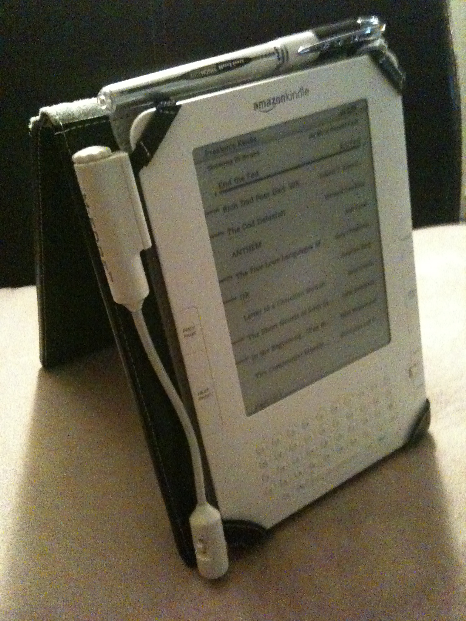
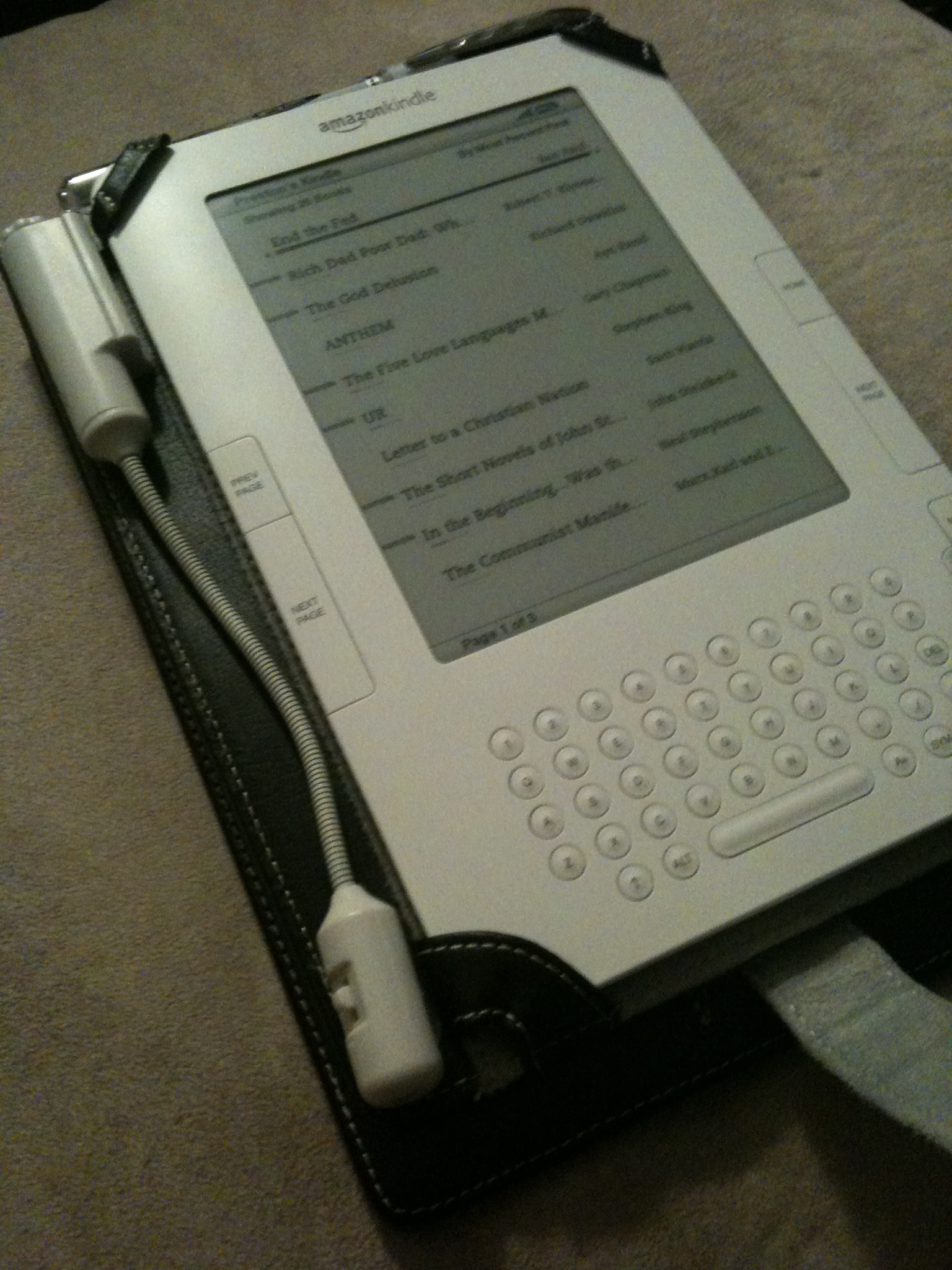
Kindle 2 with M-Edge Leather Platform Jacket and optional e-Luminator 2 book light.

The Kindle 2 is my first commitment to electronic books and e-ink screen. I silently waited until several generations of eBook readers were on the market–including the Barnes & Noble Nook–before making the decision to commit to Amazon’s Kindle 2.

Physical Interface

The 6″ e-ink display that looks just like the paper of a novel you’d buy at the grocery store. Unlike computer LCD displays, the Kindle’s screen is reflective, making it easier you to read outside in natural sunlight, just like a real book.

The built-in keyboard is extremely useful, though a tad clunky feeling. It is built with physical buttons (as opposed to “soft” or “virtual” buttons used on devices like the iPhone), and takes some getting used to, especially when searching a book and navigating a variety of different screens and dialogs. Despite a bit of awkwardness that is difficult to verbalize, it’s invaluable to have these controls, especially for searching and note taking.

Internet
One of the coolest features is the built-in 3G cellular radio that is tightly integrated with the Kindle Store and works similarly to the “One-Click Checkout” feature offered by Amazon. You can usually download a sample chapter before purchasing, and of course “upgrading” from samples to full copies is very straightforward and easy.

For individual subscription charges you may also subscribe to a gamut of periodicals and blogs. While it may seem strange to offer paid subscriptions to content you can often view for free online, the Kindle versions of the content are repackaged to support the navigational structure and user interface of the physical devices, provided a more fluid experience when bouncing between your regular reading material.

Using the built-in keyboard and 4-way joystick-like device, you can even use a built-in web browser to surf the internet in a bind. Surprisingly, there are no monthly services charges for this ability, though the device clearly is not designed for web surfing. Even with free 3G service you’ll usually use your phone, laptop etc. instead.

Formats

All purchases (including subscriptions) are automatically delivered wireless to your Kindle. I’ve generally found Amazon’s “delivered in less than 60 seconds” claim to be true: even when cruising through a barren Nevada desert.

You have the ability to read your own .PDF, .TXT, .MOBI, .DOC and other documents, and are provided a free service to convert your documents to the Kindle’s native .AZW format. Note, however, that .PDF files, while displayed, cannot be re-layed out to fit the size and orientation of the screen. Constantly having to zoom in and out is annoying, so you’ll often want to convert to .AZW before transferring content to your Kindle.

Synchronization

At time of this writing, Kindle content can be managed and accecssed in four ways, the…

  • Kindle itself.
  • Kindle website.
  • Free iPhone application.
  • Free PC application.

Content purchased using the Kindle Store–via any of these interface–can freely sync amongst them, assuming they are all tied to the same Amazon account. After a piece of content is purchased, it is automatically backed up on Amazon’s servers, allowing you to delete it from the device today and easily restore it (even to a different device) sometime in the future.

Note that documents you load onto the Kindle (via a USB connection to your Mac or PC, or wirelessly for a nominal charge) will not be backed up to Amazon’s systems, nor can they be automatically synced between interfaces. It would be fabulous to have Amazon back up my own Kindle content, though since it wasn’t purchased from Amazon it seems reasonable to not offer this service. (Note to Amazon: I would pay for this feature!)

Audio

Kindle 2 with M-Edge Leather Platform Jacket and optional e-Luminator 2 book light.

The text-to-voice software turns out to be surprisingly useful. Some words, as you would expect, are consistently mispronounced and a tad distracting, but not so much as to detract from its use. Using both the built-in headphone and built-in speakers, you’ll find yourself being read to in the car, walking around campus, the grocery store.. pretty much anyway you’d normally listen to music. Mispronounced words that are a tad annoying:

  • “idea”. It is being pronounced EYE-DEE-AYE.
  • “live” as in “alive“. It is always being pronounced as in “olive“.
  • Some abbreviations that look like Roman numerals. I’m sure this is a hard one to fix, but it’s nevertheless distracting to have the sentence, “I was at the IV [pronounced EYE-VEE] office yesterday.”, but hear “I was at the ONE-FIVE office yesterday.”

There is also an “experimental” MP3 player built in. It is in no way even comparable to the interface or features provided by iPods, but nevertheless a “nice to have” feature. I use it rarely since I already carry around an iPhone and use iTunes for media management.

Additional Software Features

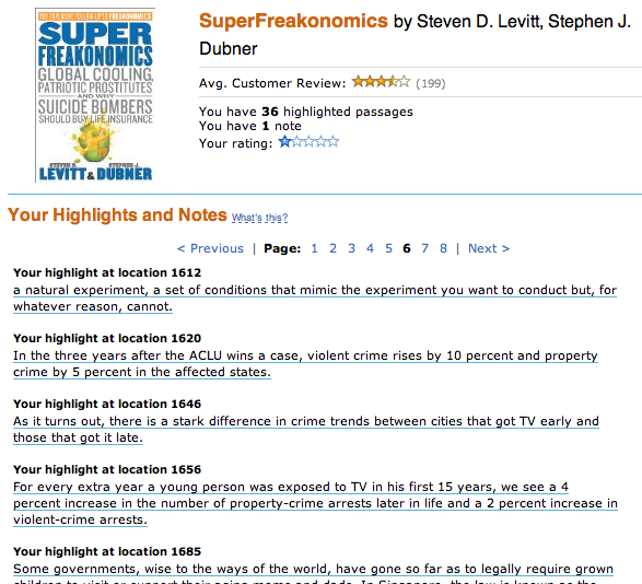
Online access to bookmarks, highlights and notes of purchased books.

Things you won’t be able to live without once you get used to them:

  • Search. One of my biggest issues with traditional, printed texts is the lack of a trivial way to search them. On the Kindle, you just start typing and hit the enter key. What’s even better is that you can easily switch the search index from the current book to sites like Wikipedia.
  • Built-in dictionary. Just position the cursor before a term, and a small footnote will appear on the bottom of the screen. (Anecdote: I just found myself physically poking a word in 10-pound textbook, as if some dialog were to materialize in the air above. As I chuckled to myself I realized that I was now addicted to eBooks, and was unlikely to ever go back.)
  • Bookmarking. The concept of a “bookmark” is only slightly different than in the physical world. Since content in the electronic world is usually defined separately from it’s presentation, layout is based on personal preference (bigger vs. smaller text), screen size (Kindle 2 vs. the larger Kindle DX), font (Helvetica vs. Arial), orientation (portrait vs. landscape), and numerous other factors. This make the concept of a “page” obsolete, because chapter 3 of a new book may appear on page 47 for one person and 32 for another. Instead, we now have “locations”, which assign a sentence or paragraph a number that can be looked up regardless of how the content gets layout out.
  • Notes.  If you like to “write in the margins” of traditional books, you can do effectively the same thing on the Kindle. Just move the cursor to wherever you want your note, click the directional-pad button, type your note, and then click the button again. You’ll now see a handy interactive superscript symbol at the insertion point. These notes also get written to a plain text file that can be read when the Kindle is plugged in via USB, at “documents/My Clippings.txt”
  • Highlighting. I love taking a bright yellow highlighter to a good non-fiction book. You can not only do effectively the same thing on the Kindle, but this metadata also becomes saved in a new file that is synced back to Amazon’s servers, allowing you to easily browse your highlights, notes and bookmarks via the web, even without your Kindle handy.

Cons

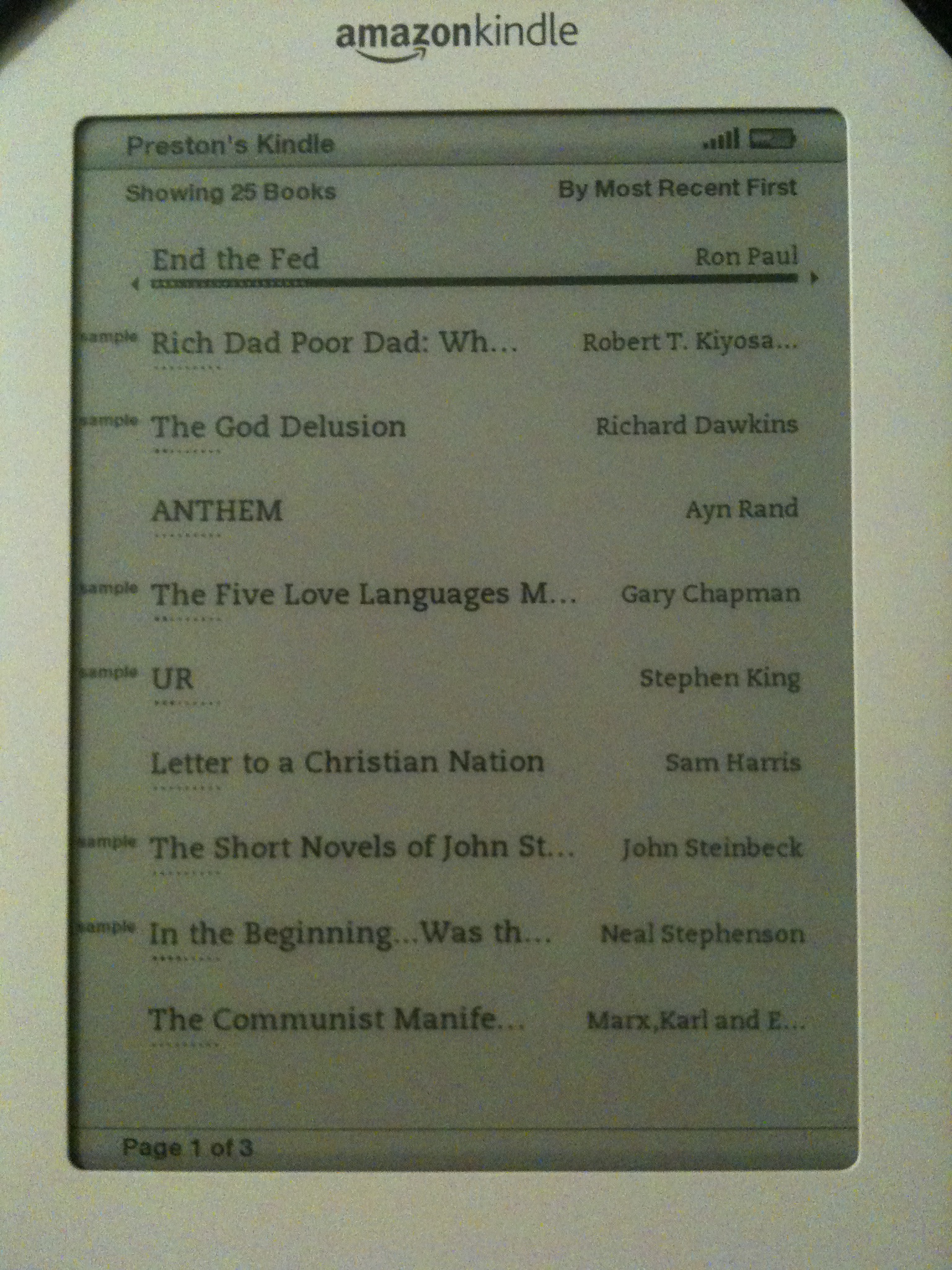
Home screen of the Kindle 2. Displayed: several purchased books and a variety of "samples" from the Kindle Store.
  • Purchased are DRM’d, and cannot (yet) be shared. I waited until the release of the Nook to make a purchasing decision because of B&N’s claim that you would be able to “loan” purchased content to friends, but the feature is, in my opinion, way too restrictive to be a prime selling point.
  • Software feels clunky, especially for someone accustomed to lots of intuitive Apple-designed GUIs. 🙂
  • Screen is slow to update, though none of the other readers on the market seem to be noticeably better.
  • Does not come with a case.
  • Keyboard could be much better.

Conclusion

While not without its flaws–most notably slowness of the screen to update–I love the Kindle and keep it with me whenever possible. For me, the Kindle is more than just a gadget. It represents a fundamental change in the way I interact with written knowledge, and resets my expectation accordingly. I fully expect large-scale consumer transition to e-ink-style display to be rocky due to nasty web of vendors, publishers and authors all vying to dominate the market early, but for the avid readers out there, it’s worth it.

Categories
business computer

SEO Is Not A Product

One of my biggest business frustrations in 2009 has centered around Search Engine Optimization (SEO): peoples fundamental misunderstandings of what SEO is, what it theoretically accomplishes, and the large number of shysters scaring businesses into pursuing activities not nearly as important as they are made out to be. Inquires usually go like this..

Preston,

My business–ACME Tires–has a basic website for customers with our logo, contact information and such, and am interested in generating more business out of it. I have asked a few people for recommendations and am now talking to several SEO providers that can provide service ranging from $100-$1,000/month. What do your SEO services cost and what guarantees do you make? (I need to be #1 on Google.) Thanks,

Alice

My initial natural inclination is to leer at my computer monitor and internalize a snide response, however, it’s not the customers fault for having a convoluted understanding of SEO, so I often send a polite, brief response, from a science and engineering standpoint. At this point, the recipient usually dismisses the information and goes about spending 1000% more than they should on services. Here’s the lowdown in plain English..

Legitimate Motivations For SEO

ACME stands to see legitimate value in several key ways from having their web presence tweaked by an “SEO expert”. Notably:

  • Higher rankings in Search Engine Results Pages (SERP). When I search for “tires phoenix, az”, ACME wants to come up as the #1 organic search result. This increases visibility over competitors and thus increases the liklihood that the searcher will click on the ACME page synopsis (and be directed to the ACME website).
  • Low Advertising Costs. When ACME uses Google AdWords to pay for ad placement in search engine results pages, Google must determine an appropriate cost for a click-through event on the ad. (In other words, ACME will pay Google whenever a user click on an advertisement and is directed to the ACME website.) The algorithms for making the cost decision are not public information, but are based partly on relevance of content. If Google thinks ACME Tires is the best thing since sliced bread, costs will be lower than if Google thinks ACME is a bakery or jeweler.

Illigitimate Terminology

The very legitimacy of the term and notion of “Search Engine Optimization” is debatable. The core function of a search engine is to guide people to content in such a way that the “right” resources can be found using brief, relevant terms. The job of the ACME Tires website is to provide information and services to ACME customers regarding tires. It is not ACME’s job to be an expert in the search engine marketplace. It could be argued, then, that the notion of SEO is a moot point, as it should be the job of the search engine vendor to figure out how to best index and present content in an optimized way. This being said, the Developer of the ACME website does have a list of technical tasks that need to be done to assure that content is well indexed and legitimate best practices are used–which I will not go into here–to put the most important site concepts at the forefront of search engine visibility. But we should NOT think:

  1. the ACME website is part of the search engine itself,
  2. the site cannot be “picked up” by search engines without extensive blackhat techniques, or most importantly,
  3. it is ACME’s job to make sure search engines (Google, Bing, Yahoo! etc.) function properly.

The term “optimization” as used by most SEO companies can be better described as “gaming”. Search Engine Gaming (SEG) is a more accurate term than SEO because it reflects that the intent of site tweaking is to gain marketing favor, and improving content from the standpoint of the consumer is of secondary concern, if at all. From this point forward I will refer to activities that both improve marketing value and improve content consumability as “SEO”, and activities that improve marketing value but are indifferent to or negatively impact content as “SEG”.

Blackhat SEG Shysters

An unfortunate number of sleezeballs sell ethically questionable “SEO” services. This is not to say that there isn’t technical work being done nor that they cannot show marketing results, but they choose to do so in ways that make reasonable engineers cringe in disgust. No definitive list of “black hat” activities is completely agreed upon, and as with issues like U.S. health care, it’s a highly subjective topic wherein opinions greatly vary. Unfortunately, those that have the most to gain (vendors) are often leading the debates and giving the seminars, which is skewing public perception of SEO and what is/isn’t necessary. Common activities that I consider black areas (or grey, at best) include:

  • Keyword Stuffing. One of the easier ways to increase SERP placement is to cram as many important keyword and search phrases into your website as possible. I personally define keyword stuffing to be, “Page copy intentionally packed with a set of repetitive phrases to the point of becoming frustratingly redundant, difficult to comprehend, or otherwise awkward to read.”
  • Referrer Parsing. Whenever you click the ACME ad, the server running the ACME website knows the website from whence you came. When you come from a search engines, the site may be able to determine the search terms you used to find the link. This detection can all happen before the ACME website is rendered, which means when you search for “tracktuff tires, az” and click through to the ACME website, the ACME webserver can dynamically generate a headline reading “TrackTuff Tires Now 50% Off In Arizona!”, regardless of how relevant the “tracktuff” name or brand actually is to the ACME website. Now, for some reason, all the SEO consultants I’ve met that are doing this seem to think they invented it. (Seriously, I even know one guy that’s trying to get a patent for it.)
  • Automated Article Submission. Databases of articles are a great place for users to do general research and discovery. If you’re automating “article” submission to hundreds of databases simultaneously, however, you’re submissions will almost certainly be little more than biased PR and marketing content oriented towards getting links to ACME. Actually, there are many “article databases” that fully acknowledge and support this as a way to increase visibility of their own ads.
  • Automated Link Generation. Business adopting social media as a form of customer service and marketing often complain of the time required to pursue the natural creation of inbound links. This makes the business very receptive to vendors claiming to have solved the “social media time commitment problem” by automating responses to social networking and social media comments. To an engineer, doing so obviously misses the whole point of social media/social networking technology and is another form of spam. Additionally, the value of doing this on blogs and forums is next to nothing (due to the rel=”nofollow” attribute). Plus, the best links will generally come from partner websites and large-scale references in protected, reviewed publications such as journals and newspapers, which cannot be automatically generated for obvious reasons. In short: it’s pretty safe to consider automatic link generation a form of spam.
  • Email Spam. This is obviously a Bad Thing to do, but that doesn’t stop tons of vendors from doing it legally. The U.S. CAN-SPAM act does not require people to explicitly opt-in to be put on a mailing list, given they have some form of “relationship” with the company. Also, certain types of organizations–notably religious and political–may be exempt from some of these laws entirely.

Stupid Guarantees

A SEG company making a “#1 on Google in 24 hours!”-type claim is almost certainly using blackhat techniques and/or getting you prime placement for a term so long and specific to the point of being useless. For example, it shouldn’t be surprising that “acme tires phoenix arizona” would turn up the correct page first on a search engine, because:

  1. the intent of the searcher is almost certainly to find this one specific business website, and
  2. there are probably only a handful of resources on the web that match these terms well.

A search engine like Google might even return a map to the store in the first results page. Getting #1 placement for “tires arizona”, however, will be much more difficult since the search phrase will match many more web resources than the first, and, from the perspective of a small business owner, some of the competitors will have the time and money to put magnitudes more content online, and supplementing that content with marketing campaigns and PR.

Closing Thoughts

SEO/SEG is a technologically and ethically grey area, and vendors not defining clear boundaries of what they do for your money should generally be avoided. Do spend some effort making sure copy and syntax of website pages are thoroughly written, well-designed for usability and structured for search engine comprehension. But instead of paying a monthly service contract to an “SEO guy”, put that money into continued development of content that will please existing customers and help attract new ones. Pay attention to your placement in search engine results, sure, but at all times, stay focused on building value and meaningful business relationships over click-through rates and SERP rankings.

Categories
personal

How To Prepare For Ignite

ignite_phoenixI recently had the pleasure of speaking at Ignite Phoenix 4, and thought I’d share my perspective to those presenting in the future.

See, all my life I’ve been in performing musical groups–rock bands, solos with larger concert bands, marching bands etc.–so despite being introverted to a fault, I’m not easily intimidated by anything in the “performing arts” category, and am usually up for giving things the old college try. Within the past couple years I’ve become accustomed to speaking regularly at various city events, local tech groups, conferences etc., so I initially shrugged off the preparation as something I could bust out in an hour or two over a Heineken… or two.

I was wrong.

Now, I’m not dumping this information on you because you need to know my life history, but to strongly emphasize that even if you took Public Speaking in college, have performed literally hundreds of times in public, and have plenty of real-world speaking experience…

Preparing for Ignite is different.

It’s a wonderfully unique and fun experience, but I put more effort into my five minutes of Sun Tzu: The Art of…Business? than I usually do for 30-45 minutes of less creative informational content. Let’s look at why…

(1) Delivery timing is your biggest risk of failure.

Ignite fully automates the progression of slides; you cannot control advancement to give yourself even +/- 1 second. Also, for Phoenix at least, there’s neither a warning for how much time remains on the current slide, nor a preview of the next slide. If you’re accustomed to board-room style speaking with a forgiving remote, secondary screen full of notes/widgets, and 5-10 minutes of “padding” at the end, the Ignite format is a cold glass of water to the nether regions.

With a remote, keeping your verbal momentum lined up with slide advancement is relatively easy. You know exactly when your verbal punchline is going to come, and just hit the remote a split second before you say it. But in Ignite, the only way to get your voice and slides anywhere even remotely in the same synchronization ballpark is to practice the bloody hell out of it way ahead of time.

And when you’re done practicing, take a break and practice some more. Practice going slower and having to catch up. Practice going too fast and having to ad lib a few extra sentences here and there to fill “dead air”. Practice without any “next slide” or timing aids. Lather. Rinse. Repeat.

This is not to say that you should script the entire thing. Scripting sounds unnatural and dull. You should, however, know the subject matter inside and out, and know the outline and “story arc” of the presentation so that when you stumble on words or get out of sync, you’ll be able to recover.

For the audiences standpoint, your level of preparation will be abundantly clear. It’s obvious who didn’t have a verbal outline prepared; who didn’t practice for pacing; who did prepare but can’t handle being over/under time; how generally hard it is to time yourself versus a computer.

And much of this practicing should occur before your slides are due.

(2) Your slides need to be completed waaaay in advance.

Ignite isn’t the only event that requires final decks to be submitted in advance, but I know that many of you are in the habit of staying up ’til 4am day-of putting the (hopefully) finishing touches on slides. You can’t do that. The Ignite superheros need your slides early to prepare their technical voodoo, and asking them to update a few slides at the last minute would be very, very lame of you. Getting your slides prepared and finalized early is critical since you can’t practice delivery without them, and once they’re submitted you should assume that you can’t change them.

Get peer feedback before you submit your slides. My thanks goes out to Erica, Ben and Marc at OpenRain for providing the “you’re trying to say way too freakin’ much” feedback … it made the end result much better than it would have otherwise been. Peer review is always difficult to do, but discovering why you’re epically fail-sucking is the only gateway to improvement.

(3) You don’t get to rehearse in the venue.

The Ignite (Phoenix) folks want to keep your delivery fresh, natural, and full of adrenaline to showcase your passion. This is a good thing. Just be aware that you probably can’t walk out on stage beforehand for a quick run-through by yourself.

(4) Your bar is high.

In general public speaking, the audiences wants you to succeed. And when you’re speaking to an audience that is present for your message–such as Ignite–they’ve already built expectations of how awesome your message and delivery will be. If the message(s) couldn’t sell, there wouldn’t be an audience. You are expected to be awesome.

I’ve yet to meet anyone that says “Ignite sucks”, but have heard plenty of “Oh, it was awesome, but remember that one guy/gal? He/She was horrible.” Don’t be that guy/gal whose idea of originality is to do zero preparation and just “wing it” or divert from the slides in a otherwise distracting, unprofessional mess. People come to see great ideas from passionate, knowledgeable people, and it’s going to take some work to get that across in Ignite’s concise format.

Ignite preparation checklist. (Sorted by due date.)

  1. Well thought out proposal submitted.
  2. Talk accepted.
  3. Slide draft and verbal outline complete.
  4. Peer rehearsal and feedback.
  5. Adjust.
  6. Final sanity check.
  7. Submit final slides.
  8. Practice.
  9. Sit in parking lot for 15 minutes before event practicing by yourself. (Strange looks from passers by expected!)
  10. Be excellent.

You have the idea and the passion. Now go show us! (Just keep it brief.)

Categories
computer photography

MinoHD 720p Digital Camcorder Review

flip_minohd
While no one wants to see your entire 180-minute reenactment of Hamlet, it’s nevertheless nice to have a camcorder handy once in a while. Usually I’ll bust out a pocket-sized Canon SD750 when I need a couple minutes of motion capture, but the SD750–as well as most other low-end digital cameras–aren’t fabulous at video, and can have issues recording single streams over a couple minutes. I’d love something in the prosumer class, but I simply don’t need video recording enough to justify the cost. And even if I did, I wouldn’t be able to fit it in with my normal photography equipment.

The MinoHD is a 720p, 30fps, all digital video recorder roughly volume equivalent to an iPhone: thicker but narrower. Video is encoded in variable bit rate H.264 with AAC audio. (Perfect for use on a Mac.) 4GB of internal flash memory holds about 60 minutes of video, but the storage is neither removable nor interchangeable. The battery is also internal, and charges from the USB connection automatically. A tiny color LCD screen allows for playback and deletion of recorded videos, and provides no special recording effects such as useless cheesy color filter nonsense typically present on consumer camcorders. Costco retail pricing is $179.

Recording a movie is as simple as turning it on and pressing the big red button. Hit the big red button again to stop. It took me approximately 10 seconds to master the process. (An intelligent dog could be trained to do the same if the buttons were bigger.) Use of the “FlipShare” software is not required to transfer video off the device. Just plug it in to a USB port and move the files off. If you choose to use FlipShare, it provides basic video management and editing capabilities, and appears to be necessary to update the MinoHD’s firmware. I’m using FlipShare for now, but like the option of not using it.

Pros

  • H.264/AAC.
  • 720p.
  • USB connector built in. (No need to carry a cable.)
  • Inexpensive.
  • Rediculously usable.
  • PC/MAC friendly.
  • Solid-state.
  • Light and small.
  • No special software required for day-to-day use.

Cons

  • Less than 1080p.
  • No built-in light.
  • Cannot upgrade flash storage.
  • Battery cannot be changed.

Verdict

Highly recommended for those wanting a cost-effective HD camcorder for light, periodic use.