Categories
computer personal Uncategorized

Makerbot Thing-o-Matic 3D Printer Print Pictures & Product Review

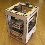
The Makerbot Thing-o-Matic, fully assembled and ready to print.

[Update: Welcome back, Slashdot! 🙂  This site is in full lockdown mode, so comments may take a little while to appear, but please leave them anyway! You may also want to check out the previous assembly photos also featured on Slashdot.]

Overview

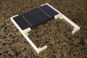
3D printing has attracted notable attention in recent years, capturing interests of both geeks and laymen due to the obvious potential of a machine that fabricates three-dimensional shapes at will. While clearly far from the visionary “replicator” technology of Star Trek: The Next Generation–which could recycle almost any object–the Thing-o-Matic (and the like) have already begun branching out from the 3mm ABS plastic spools used build the objects in the following pictures. (I’ve also included picture from a another project that requires custom mounting widgets for solar cells.)
I’ve had my Makerbot Thing-o-Matic working for about a month, and I have to assume it only gets cooler from here. If you’re a hardcore DIY’er, or your technical dablings tend to involve small, intricate parts required of custom robotics, circuitry, metal/woodworking etc., read on, and seriously consider a 3D printer investment in the future.
The Unboxening & Assembly
Unboxing of the Thing-o-Matic kit. (See links for assembly pictures.)

After a couple months of girlish waiting, my DIY Makerbot Thing-o-Matic kit arrived in December 2010. Pictures of the laborious assembly process went up several days after, and have been viewed by tens of thousands of people in the last few weeks alone. Makerboot does not ship a printed manual with the machinery kit, instead option for an online-only “Thing-o-Matic Assembly Instruction/Users Manual”: a living collection of wiki pages that is continually updated. A good thing, indeed! Take a look at the assembly pictures if you haven’t already gotten a feel for the level of assembly effort. (If you’re good with your hands, allocate about 16 hours.)
Software Installation
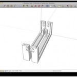
My 3D model of an identical pair of custom solar cell brackets, done in Google SketchUp.

Once the machine is assembled, you’re ready to install the software, connect the machine via USB, and calibrate the system. Rough high-level steps are as follows:

  1. Install the Arduino driver, if not already installed. (Easy)
  2. Download and run ReplicatorG, and try making a software connection to the machine. (Easy. You’ll spend a lot of time in ReplicatorG.)
  3. Use ReplicatorG to manually control all the machines widgets, and test each one for proper function. (Medium.)
  4. Measure the the Z-axis height and change an obscure config file in your ReplicatorG software that you won’t understand for a few more days. (Medium.)
  5. Load up some plastic filament. (Easy.)
  6. Skeinforge interaction can be a frustrating chore.

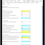
    Within ReplicatorG, launch the embedded Skeinforge configuration application, which is used to take 3D design files in .STL and “slice” them in tooling paths that a machine can follow. This is necessary since 3D printers usually print in layers, starting with the lowest. Skeinforge is an extremely configurable system with an extremely shitty GUI. It is not immediately clear what most of the hundreds of settings do, and you’ll spend many trial iterations configuring options to dial in the best general settings. Even after calibration, you will need to periodically revisit Skeinforge to address build-specific issues. (Hard.)

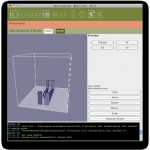
  7. ReplicatorG build platform positional and orientation. Perfect!

    Use ReplicatorG to either upload a compiled .S3G files to the on-board SD card for disconnected printing, or stream the commands on the fly. (Easy.)

  8. Run the test job!  (Medium.)
  9. Go to #6. (Daunting.)

The workflow is initially very daunting and cumbersome. It starts to make more sense after a while, but needs major work. This is technically not Makerbot’s issue, but given that it’s a necessary component of the overall system I would suggest major effort be placed in unsuckifying the interaction before ReplicatorG and Skeinforge.

ReplicatorG
Once many initial configuration jobs are complete, your time in software will generally be spent across two applications:
  1. 3D design software package such as Google SketchUp (free), which is used to design your own objects. Once you’ve designed an object, you export an STL file that is imported into ReplicatorG, which is then sliced by Skeinforge into .gcode files and then by ReplicatorG into .s3g files that the Thing-o-Matics onboard Arduino understands.
  2. ReplicatorG (and included Skeinforge application), tweaking, compiling, and babysitting.
Materials
The Makerbot MK5 plastruder turns 3mm filament into hot, sticky plastic goo.
The mechanism that feeds, melts, and dispenses plastic on the Thing-o-Matic, Cupcake, RepRap and other 3D printers is called the “extruder”: often referred to as a “plastruder” for those designed to extrude plastic. Thing-o-Matic ships with the “Makerbot MK5 Plastruder“, designed to feed solid 3mm spool of plastic filament into a heating element that melts and dispenses a thin stream of melted plastic.  ABS is essentially Lego plastic, and solid at room temperature. (Grab a handful of Lego bricks to get a feel for the weight, texture, color of ABS.) At the melting point slightly above 220 degrees Celcius, ABS turns into a half-solid, half-liquid ooze that is melty enough to extrude into the shape of your choice, while remaining solid enough to hold form long enough to cool back into a solid.
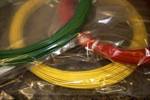
Many different colors of ABS filament are available. These 1 lbs. packages of red, yellow and green plastic were purchased for $15 each as part of a larger order.
In my area (Phoenix, Arizona, apparently the 5th largest city in the United States by population), I’ve yet to find a local source of the stuff. I’ve called sales departments of several local plastics suppliers, and none have even known where to find it. I’ve also failed in contacting several other online suppliers; my requests for quotes have all gone unanswered. While happy with the two ABS shipments I’ve received from Makerbot, but it would be nice to have competitive options in the low-volume market. Makerbot sells 5-pound spools of “natural” (off-white) colored ABS for $45 (USD), and a variety of colors for $65 (USD) plus applicable taxes and shipping. And shipping is not free.
Assessment
Solar cell bracket revisions.
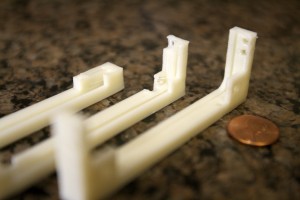
Revisions 1, 2 and 3 of the solar cell bracket, from left to right.

Given the complexity of the machinery, you have a lot to consider before making the investment.

Thing-o-Matic Pros
  • Extremely cool. You will almost definitely be the only kid on the block with this toy.
  • Makerbot maintains the Thingiverse: a user-driven database of open source 3D objects.
  • Semi-automated batch jobs via the included Automated Build Platform.
  • All needed parts and come with the kit. (BYO tools.)
  • Supplies (such as ABS) are also available from Makerbot.
  • Some parts, such as this pair of brackets printed simultaneously, need trimming and/or sanding.

    Documentation is 4 of 5. The 5 is for comprehensiveness and getting me through the process, but -1 for ocassionally erronous images, ambiguous text, or omission of step.

  • Minimal soldiering, and much less than I’d anticipated.
  • Minimal number of “only one chance” assembly instructions such as cutting and gluing,
  • Open Source hardware design. You can print many of your own replacement parts if some break.
  • Science!
Thing-o-Matic Cons

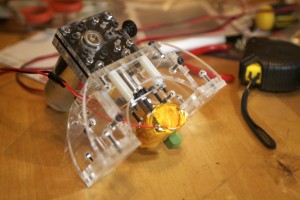
Four solar cell bracket are shown partially assembled into a larger structure.

  • Generally not robust enough to run unattended.
  • Post assembly calibration gets fuzzy, as there is no 100% Right Way to do things.
  • I’m 90% sure that something about the Arduino driver is unstable. I regularly make my entire Mac greyscreen (the OSX equivalent of a Windows BSOD or a Linux kernel panic) during plug/unplug process of connecting/disconnecting the USB from the Makerbot to my computer.  Something, somewhere, is dying a horrible death and taking my whole operating system with it.
  • Skeinforge–the software that converts your 3D models to tool paths–has an absolutely atrocious (and ofter unstable) user interface. Few of the 100+ configuration options are clearly documents within the app, which is buggy to start with.
  • The machine can be somewhat loud and obvoxious. In my case, the XY axes aren’t bad, but the Z axis stepper motor can be very irritating.
  • If you do this, you are making a very big time commitment.
  • Questionable electronic sub-component failure rates, and one of my biggest complaints. The motor on my MK5 Plastruder was dead on arrival, and my power supply went out after less than a dozen prints. I could just be unluckly, though.
Costs & Competition
Lots of small custom components.

Many small pre-fab printer shops have materialized in the last couple years, ranging from laser-cut wood frames (such as Makerbot), to clear acrylics, metals, and, of course, printed plastics. Regardless of your chosen path, the electronic components are currently not printable in any high-quality manner, are best purchased from a vendor. This includes mainboard microcontroller (the Thing-o-Matic uses as Arduino MEGA), stepper motor controllers, stepper motors, power supply, end stop sensors, extruder controller, cables etc. You can, of course, build these yourself, but in the case of highly available parts such as the Open Source Arduino, it’s far more cost effective to buy the $30 part than spend a day manually fabrication a PCB and hand soldier $20 of mail-order components.
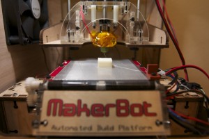
20mm Test Cubes
Four iterations of the 20mm test cube: A, B, C and D.
Makerbot’s pricing ($1K-2K per machine) targets the small power user. Competition is available, but thin and very fragmented. A RepRap kit from one company may not be 100% compatible with the electronics kit from another. That’s just the nature of Open Source hardware. I love the idea of Open Source standards implemented and supported by commercial vendors, and Makerbot’s staff has done a great job so far. (Special thanks to Ethan H. for being the unfortunately soul responsible for handling both of my failure reports as well as one incorrect shipment. You’re awesome, dude!) You can also grab an older model at significant discount.
20mm Test Cube Print
Another 20mm test cube being printed.

In short, unless you have a Richard Stallman-level of commitment to F/OSS, try to buy all your components from only a few vendors. Makerbot is a good choice for U.S. buyers as though they only sell their own designs–a good thing, IMHO–but then, they don’t sell RepRap parts. If you want a RepRap, the choice is more difficult. I have not built a RepRap, but suspect that even with a larger vendor ecosystem it would be difficult to bring the total price tag for a laser cut or milled non-clone machine to under $1K for quality parts, electronics and components.

Closing Thoughts & Recommendations
The biggest barrier to entry is not price, but difficulty. No fabrication, assembly, software, design, calibration, of troubleshooting process is theoretically undoable by any able-bodied person, but the same can be said for rocket science.
You need a decent understanding of robotics, hardware, software, electronics and mechanics, need a little hand dexterity and a ton of patience. (Without these skills, you’ll definitely get frustrated.) You can do it, but if you can’t sit at your workbench in 2-hour stretches assembling (and occasionally reassembling) a part, going through many print iterations (over the course of days) to get it just right, you may want to consider having a shop print parts for you, or looking into a commercial laser cutter or milling machine instead.
Consumer 3D printing is still in its infancy, but the Makerbot Thing-o-Matic (and ancestry) are clear and decisive steps towards a day when all forms of matter can be assimilated from raw materials as easy as loading a coffee maker. Despite a few questionable design choices of electronics components, I give the Thing-o-Matic an overall 4-of-5 star rating and highly recommend either a fully compiled kit (like I did here), or pre-assembled kit for a few hundred USD more, assuming you’re comfortable with the prerequisite knowledge, time and money commitments.
Score Breakdown
  • Documentation: 4 of 5
  • Ease of Use: 3 of 5
  • Coolness: 5 of 5
  • Price Competitiveness: 4 of 5
  • Support: 5 of 5
  • Quality: 3 of 5
—————-
Overall: 4 of 5
Recommended for:  Hardcore geeks looking for a ton of fun in a challenging meta-project.
Additional Media
Thing-o-Matic First Prints
Blurry Thing-o-Matic Up Close
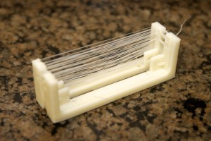
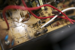
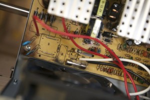
My power supply has an fatal failure after a handful of prints. Makerbot has sent a replacement free of charge.
The blow-out seems to be a capacitor. I believe that the power supply may not have enough kung-fu to power all the components.
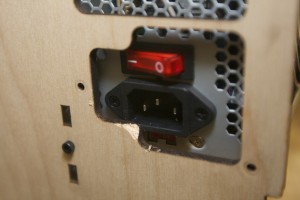
I hacked in a new power supply with higher specs, but it didn't fit perfectly. 🙂
Categories
personal

Kindle 3G Upgrade: Mini Review, Recommendations

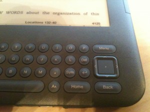
The "Home", "Menu" and "Back" buttons are now to the right of the keyboard.

I’ve previously expressed my love for the Kindle family of devices, and on a whim decided to upgrade from the Kindle 2 to the new Kindle 3G with 3G and wifi. For others contemplating the upgrade, here’s what you need to know:

Pros

  • The new button layout is way better. Next/Previous button are on both sides of the screen, and Home and Menu buttons have been moved to the keyboard area, along with a new direction pad (“d-pad”) design that is easier to use, albeit different.
  • Smaller device footprint. Kindle 3 feels more compact and portable than Kindle 2.
  • The screen update time is noticibly better, but only slightly so. It’s definitely noticable and a welcome improvement, but don’t expect LCD-level performance here. It’s still e-ink.
  • Wifi! Not that on the more expensive model, you have both wifi support as well as the free 3G access.

Cons

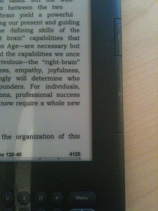
"Next" and "Previous" buttons are now on BOTH sides of the device. A welcome change!
  • $189 for a bunch of marginal upgrades is a tough sell.
  • Keyboard is still ghetto. It feels like typing on a 1990’s scientific calculator.
  • The Next/Previous buttons depress easier than before, but they’re also smaller and don’t have any nubs to identify the button by touch. This seems stupid.
  • Sharper screen. It’s a subtle improvement, but definitely feels crisper.

Recommendations

  • New users should go for it, and light readers should be perfectly fine with the Wifi-only $139 model.
  • Existing users with heavy usage patterns (at least an hour a day on average) should go for it. You’ll love the small speed improvements when highlighting and flipping pages.
  • Existing Kindle 2 owners with light usage patterns should skip this revision. Future models will certainly see further improvements and lower costs.
Categories
personal

Book Review of DIY U: : Edupunks, Edupreneurs, and the Coming Transformation of Higher Education


Question: If I complete my general physics and mathematics studies using freely available MIT OpenCourseWare content on my own time, computer science study on campus at ASU Polytechnic, and general education requirements at UoP, all for a degree program at Berkeley, what’s wrong with that? After all, as long as I can demonstrate the competancies outlined in its program of study, isn’t this effectively more-or-less the equivalent of the Berkeley-delivered version costing possibly 10x more in total? Good for me… right? And if so, who cares?

Answer: Hundreds of years of authoritative people vetted in an aggrandizing aristocracy of exclusionary education. That’s who.

Universities best interests are not necessarily aligned with those of students, and as DIY U explores, the differences can be disheartening to the point of infuriating. Given a long-established tradition of prestigue through extreme selectivity and absurd financial requirements, it is understandable that many universities are struggling to find their way in the Information age.

I enjoy looking at political issues though numbers, statistics, historical analysis, and really any sort of empirical evidence lending insight to the world around us. With regards to education, it is obvious that we have yet to fully realize how Internet-enabled technologies fundamentally change how we should perceive learning, and due to the explosive growth of exploratory online systems it is critical we define realistic paths to evolve traditional, costly, centralized, campus-oriented, course-based university programs to the increasingly decentralized, affordable, online, multi-national, outcome-based demands being pushed by current generations of students. DIY U investigates this gap using historical evidence, anecdote, current statistics, and critical analysis: exactly the type of writing I look for in subject matter of high debate.

Of particular interest to me are the many statistics on past, current, and projected future costs of higher education. Not that this should be shocking, but the gist is that the current model just isn’t going to work if we really want to positively improve the general education level of the American population. (And I think the whole world would nod in violent support of this goal.) Simply using federal subsidies to (attempt to) expand an already antiquated model of education would be outright foolish.

I also particularly enjoyed the sections on different paradigms actively being used to varying degrees of success, specifically outcome and competency assessment-based learning. I’ve attended four higher-ed schools to date, and find the requirements of having to take specific course line numbers at a specific college for a specific degree program within a single university in the 21st century to be unacceptably, and quite literally, “old school”. As someone who’s said “I could have tested out of that class” numerous times, the concept makes sense to me.

If you find these topics interesting, by all means pick up copy of DIY U: Edupunks, Edupreneurs, and the Coming Transformation of Higher Education. I purchased my Kindle version for about $10 on Amazon.

Categories
business computer

Mini-Review: Meltdown: A Free-Market Look at Why the Stock Market Collapsed, the Economy Tanked, and the Government Bailout Will Make Things Worse


Meltdown: A Free-Market Look at Why the Stock Market Collapsed, the Economy Tanked, and Government Bailouts Will Make Things Worse by Thomas E. Woods Jr.

My rating: 5 of 5 stars
Meltdown is a evidence-based, academically credible, and brutally honest analysis of the causes and effects of economic depression faced in the United States since the early 1900’s. Thomas Woods’ almost adversarial opinion of the Federal Reserve is approached via many different approaches and data sources, as is his affinity of Austrian business cycle theory. (As opposed to Keynesian economics primarily seen in the U.S.)

For those with interest in macroeconomic theory or the effects of government intervention on both business and individual finance, this is absolutely required reading. Those with politically libertarian leanings will also find many of the facts presented within outright shocking. I personally finished the electronic version of this book with over 10 pages of highlights, and plan to continue following Woods’ work.

View all my reviews >>

Categories
computer personal

Amazon Kindle 2 Review

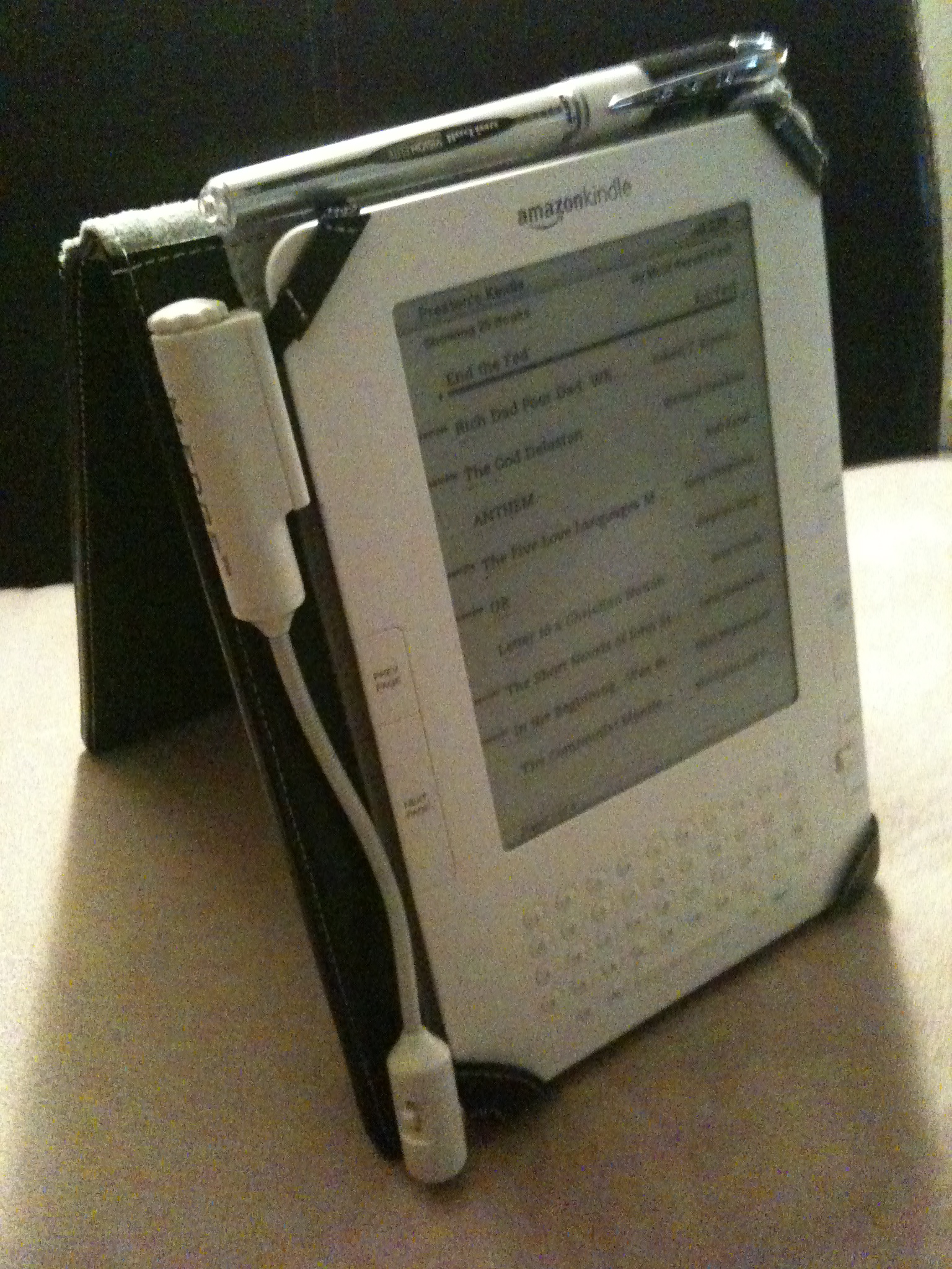
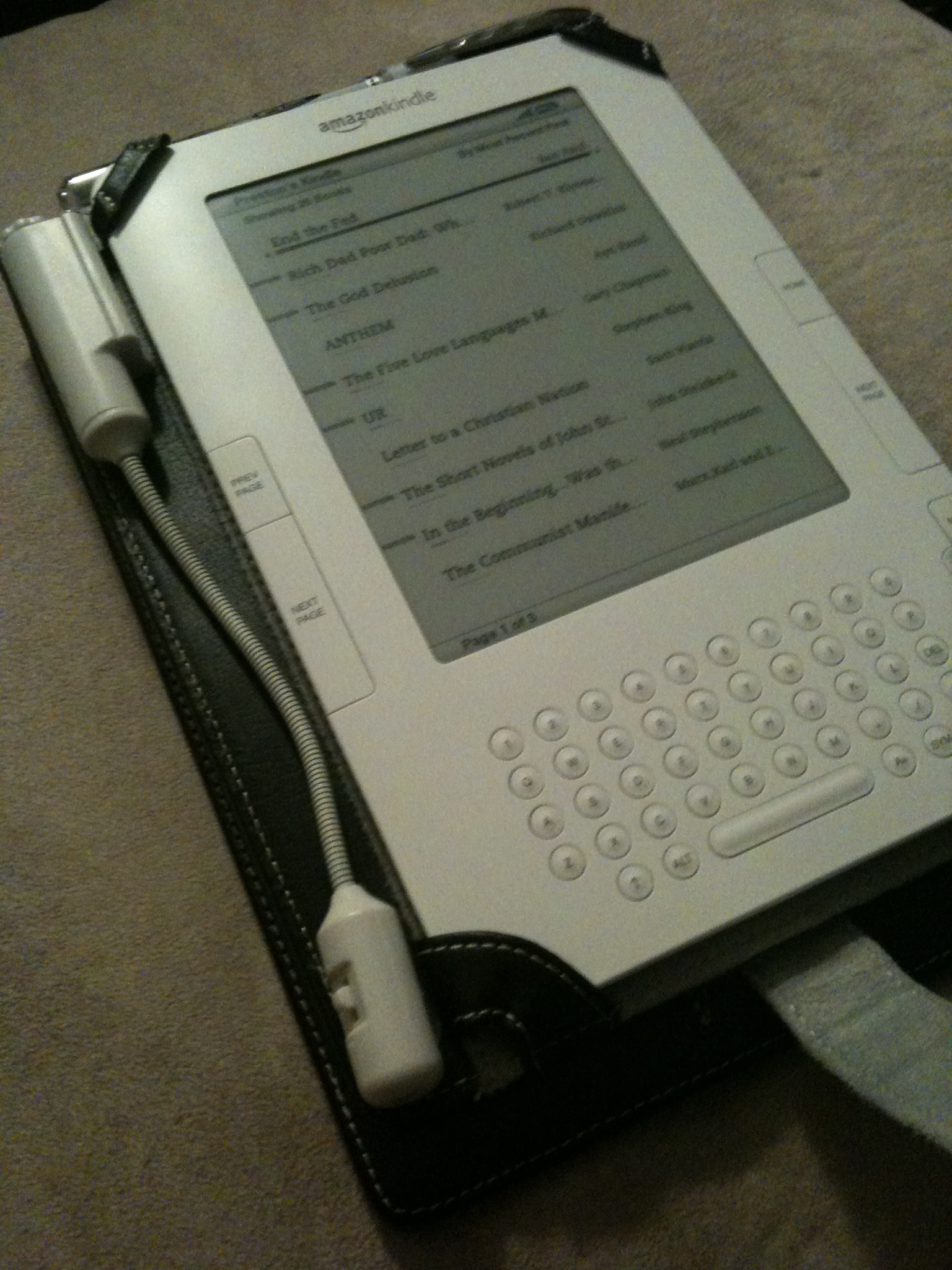
Kindle 2 with M-Edge Leather Platform Jacket and optional e-Luminator 2 book light.

The Kindle 2 is my first commitment to electronic books and e-ink screen. I silently waited until several generations of eBook readers were on the market–including the Barnes & Noble Nook–before making the decision to commit to Amazon’s Kindle 2.

Physical Interface

The 6″ e-ink display that looks just like the paper of a novel you’d buy at the grocery store. Unlike computer LCD displays, the Kindle’s screen is reflective, making it easier you to read outside in natural sunlight, just like a real book.

The built-in keyboard is extremely useful, though a tad clunky feeling. It is built with physical buttons (as opposed to “soft” or “virtual” buttons used on devices like the iPhone), and takes some getting used to, especially when searching a book and navigating a variety of different screens and dialogs. Despite a bit of awkwardness that is difficult to verbalize, it’s invaluable to have these controls, especially for searching and note taking.

Internet
One of the coolest features is the built-in 3G cellular radio that is tightly integrated with the Kindle Store and works similarly to the “One-Click Checkout” feature offered by Amazon. You can usually download a sample chapter before purchasing, and of course “upgrading” from samples to full copies is very straightforward and easy.

For individual subscription charges you may also subscribe to a gamut of periodicals and blogs. While it may seem strange to offer paid subscriptions to content you can often view for free online, the Kindle versions of the content are repackaged to support the navigational structure and user interface of the physical devices, provided a more fluid experience when bouncing between your regular reading material.

Using the built-in keyboard and 4-way joystick-like device, you can even use a built-in web browser to surf the internet in a bind. Surprisingly, there are no monthly services charges for this ability, though the device clearly is not designed for web surfing. Even with free 3G service you’ll usually use your phone, laptop etc. instead.

Formats

All purchases (including subscriptions) are automatically delivered wireless to your Kindle. I’ve generally found Amazon’s “delivered in less than 60 seconds” claim to be true: even when cruising through a barren Nevada desert.

You have the ability to read your own .PDF, .TXT, .MOBI, .DOC and other documents, and are provided a free service to convert your documents to the Kindle’s native .AZW format. Note, however, that .PDF files, while displayed, cannot be re-layed out to fit the size and orientation of the screen. Constantly having to zoom in and out is annoying, so you’ll often want to convert to .AZW before transferring content to your Kindle.

Synchronization

At time of this writing, Kindle content can be managed and accecssed in four ways, the…

  • Kindle itself.
  • Kindle website.
  • Free iPhone application.
  • Free PC application.

Content purchased using the Kindle Store–via any of these interface–can freely sync amongst them, assuming they are all tied to the same Amazon account. After a piece of content is purchased, it is automatically backed up on Amazon’s servers, allowing you to delete it from the device today and easily restore it (even to a different device) sometime in the future.

Note that documents you load onto the Kindle (via a USB connection to your Mac or PC, or wirelessly for a nominal charge) will not be backed up to Amazon’s systems, nor can they be automatically synced between interfaces. It would be fabulous to have Amazon back up my own Kindle content, though since it wasn’t purchased from Amazon it seems reasonable to not offer this service. (Note to Amazon: I would pay for this feature!)

Audio

Kindle 2 with M-Edge Leather Platform Jacket and optional e-Luminator 2 book light.

The text-to-voice software turns out to be surprisingly useful. Some words, as you would expect, are consistently mispronounced and a tad distracting, but not so much as to detract from its use. Using both the built-in headphone and built-in speakers, you’ll find yourself being read to in the car, walking around campus, the grocery store.. pretty much anyway you’d normally listen to music. Mispronounced words that are a tad annoying:

  • “idea”. It is being pronounced EYE-DEE-AYE.
  • “live” as in “alive“. It is always being pronounced as in “olive“.
  • Some abbreviations that look like Roman numerals. I’m sure this is a hard one to fix, but it’s nevertheless distracting to have the sentence, “I was at the IV [pronounced EYE-VEE] office yesterday.”, but hear “I was at the ONE-FIVE office yesterday.”

There is also an “experimental” MP3 player built in. It is in no way even comparable to the interface or features provided by iPods, but nevertheless a “nice to have” feature. I use it rarely since I already carry around an iPhone and use iTunes for media management.

Additional Software Features

Online access to bookmarks, highlights and notes of purchased books.

Things you won’t be able to live without once you get used to them:

  • Search. One of my biggest issues with traditional, printed texts is the lack of a trivial way to search them. On the Kindle, you just start typing and hit the enter key. What’s even better is that you can easily switch the search index from the current book to sites like Wikipedia.
  • Built-in dictionary. Just position the cursor before a term, and a small footnote will appear on the bottom of the screen. (Anecdote: I just found myself physically poking a word in 10-pound textbook, as if some dialog were to materialize in the air above. As I chuckled to myself I realized that I was now addicted to eBooks, and was unlikely to ever go back.)
  • Bookmarking. The concept of a “bookmark” is only slightly different than in the physical world. Since content in the electronic world is usually defined separately from it’s presentation, layout is based on personal preference (bigger vs. smaller text), screen size (Kindle 2 vs. the larger Kindle DX), font (Helvetica vs. Arial), orientation (portrait vs. landscape), and numerous other factors. This make the concept of a “page” obsolete, because chapter 3 of a new book may appear on page 47 for one person and 32 for another. Instead, we now have “locations”, which assign a sentence or paragraph a number that can be looked up regardless of how the content gets layout out.
  • Notes.  If you like to “write in the margins” of traditional books, you can do effectively the same thing on the Kindle. Just move the cursor to wherever you want your note, click the directional-pad button, type your note, and then click the button again. You’ll now see a handy interactive superscript symbol at the insertion point. These notes also get written to a plain text file that can be read when the Kindle is plugged in via USB, at “documents/My Clippings.txt”
  • Highlighting. I love taking a bright yellow highlighter to a good non-fiction book. You can not only do effectively the same thing on the Kindle, but this metadata also becomes saved in a new file that is synced back to Amazon’s servers, allowing you to easily browse your highlights, notes and bookmarks via the web, even without your Kindle handy.

Cons

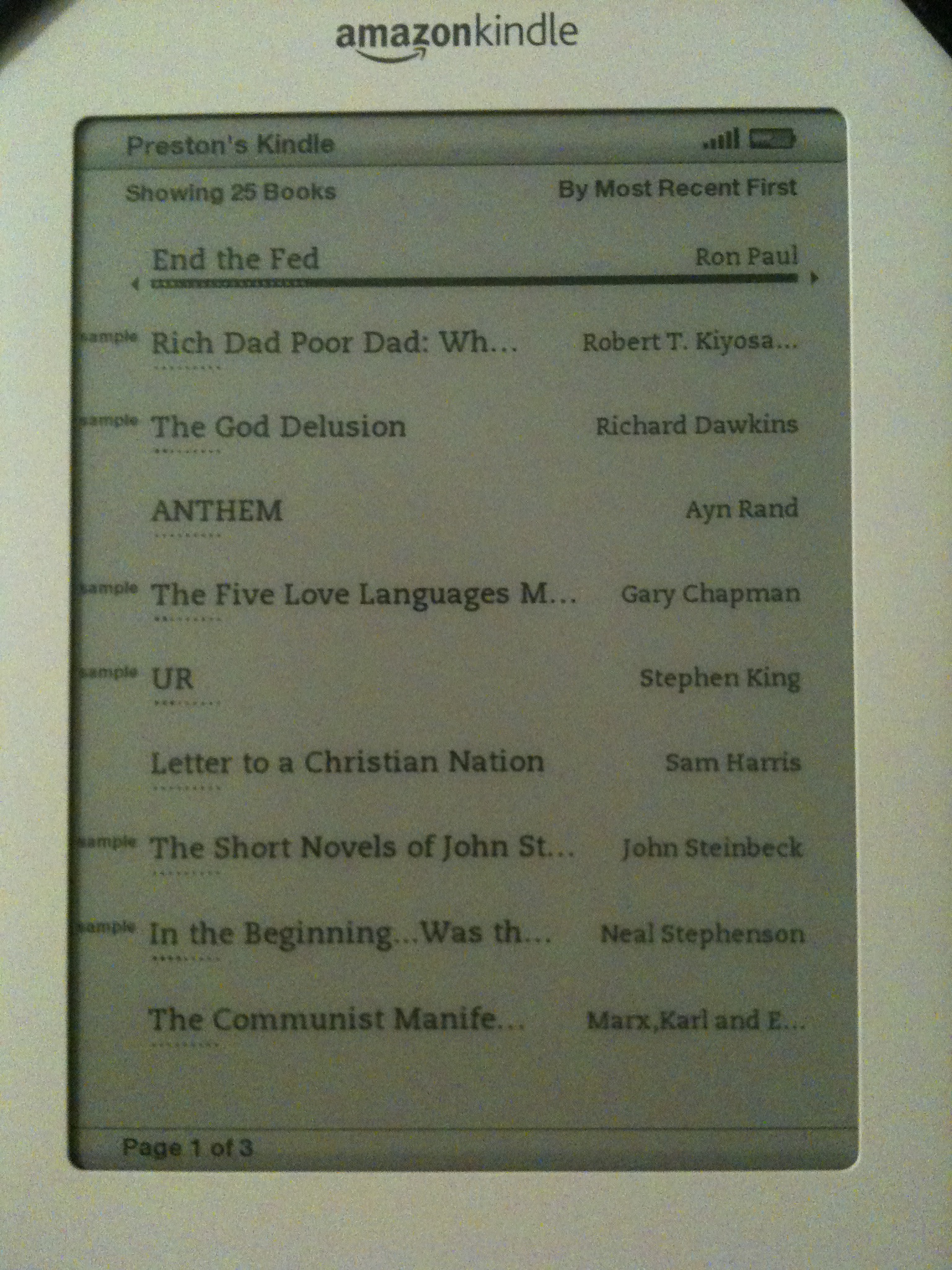
Home screen of the Kindle 2. Displayed: several purchased books and a variety of "samples" from the Kindle Store.
  • Purchased are DRM’d, and cannot (yet) be shared. I waited until the release of the Nook to make a purchasing decision because of B&N’s claim that you would be able to “loan” purchased content to friends, but the feature is, in my opinion, way too restrictive to be a prime selling point.
  • Software feels clunky, especially for someone accustomed to lots of intuitive Apple-designed GUIs. 🙂
  • Screen is slow to update, though none of the other readers on the market seem to be noticeably better.
  • Does not come with a case.
  • Keyboard could be much better.

Conclusion

While not without its flaws–most notably slowness of the screen to update–I love the Kindle and keep it with me whenever possible. For me, the Kindle is more than just a gadget. It represents a fundamental change in the way I interact with written knowledge, and resets my expectation accordingly. I fully expect large-scale consumer transition to e-ink-style display to be rocky due to nasty web of vendors, publishers and authors all vying to dominate the market early, but for the avid readers out there, it’s worth it.

Categories
computer photography

MinoHD 720p Digital Camcorder Review

flip_minohd
While no one wants to see your entire 180-minute reenactment of Hamlet, it’s nevertheless nice to have a camcorder handy once in a while. Usually I’ll bust out a pocket-sized Canon SD750 when I need a couple minutes of motion capture, but the SD750–as well as most other low-end digital cameras–aren’t fabulous at video, and can have issues recording single streams over a couple minutes. I’d love something in the prosumer class, but I simply don’t need video recording enough to justify the cost. And even if I did, I wouldn’t be able to fit it in with my normal photography equipment.

The MinoHD is a 720p, 30fps, all digital video recorder roughly volume equivalent to an iPhone: thicker but narrower. Video is encoded in variable bit rate H.264 with AAC audio. (Perfect for use on a Mac.) 4GB of internal flash memory holds about 60 minutes of video, but the storage is neither removable nor interchangeable. The battery is also internal, and charges from the USB connection automatically. A tiny color LCD screen allows for playback and deletion of recorded videos, and provides no special recording effects such as useless cheesy color filter nonsense typically present on consumer camcorders. Costco retail pricing is $179.

Recording a movie is as simple as turning it on and pressing the big red button. Hit the big red button again to stop. It took me approximately 10 seconds to master the process. (An intelligent dog could be trained to do the same if the buttons were bigger.) Use of the “FlipShare” software is not required to transfer video off the device. Just plug it in to a USB port and move the files off. If you choose to use FlipShare, it provides basic video management and editing capabilities, and appears to be necessary to update the MinoHD’s firmware. I’m using FlipShare for now, but like the option of not using it.

Pros

  • H.264/AAC.
  • 720p.
  • USB connector built in. (No need to carry a cable.)
  • Inexpensive.
  • Rediculously usable.
  • PC/MAC friendly.
  • Solid-state.
  • Light and small.
  • No special software required for day-to-day use.

Cons

  • Less than 1080p.
  • No built-in light.
  • Cannot upgrade flash storage.
  • Battery cannot be changed.

Verdict

Highly recommended for those wanting a cost-effective HD camcorder for light, periodic use.

Categories
Uncategorized

Book Review: slide:ology

slideology

I recently received a review copy of slide:ology – The art and science of creating great presentations by Nancy Duarte, published by O’Reilly Media. I’m consciously making an effort to increase my frequency of speaking engagements, so I was thrilled to see a modern text on visual aids from a heavy usability-oriented angle. I’ve read the first two chapters so far and skimmed the majority of the remainder.

slide:ology is cleverly designed to read and flow like a presentation itself, although the content is far more in depth than an ordinary slide deck. Each of the 275 pages is a pleasure to look at, and the individual page designs themselves provide a great deal of inspiration. I’m particularly thrilled to see such creative use of negative space and negative geometry in many of the designs. Many texts on marketing effectively use the exact opposite approach.

Pros

  • Visually inspirational. Tons of great ideal for your next keynote.
  • Useful outside of the speaking domain. Many of the design ideas can be applied to print media and web design as well.
  • Good copy which is brief and easy to follow.
  • Reasonably priced.
  • A great coffee table/break room book.

Cons

  • You may have to implement many of these designs yourself. I’d easily pay an extra $5 for an optional download of Keynote templates ready to go, as well as the raw graphics files used in production.
  • A slightly awkward print format. I understand why, but it doesn’t fit as well on the shelf as I’d life.

Overall, slide:ology is a great little piece of speaking inspiration by Nancy Duarte. Great job! (I expect more like this.)

Buy slide:ology here.

Categories
photography

Book Review: Digital Astrophotography, by Stefan Seip

Rocky Nook — a digital photography book publisher in California — sent me a review copy of Digital Astrophotography: A Guide to Capturing the Cosmos for review, which I read over the last few months.

Pros


  • A good overview of the techniques used in astrophotography.
  • Well illustrated.
  • Inexpensive.
  • Largely easy to follow for the casual reader.
  • Covers the entire process, from equipment to post-processing. I’m very well oriented with “typical” production and post-production photography methods, but was unaware of the additional complexities and tools involved with astrophotography.  


Cons


  • Casual SLR/DSLR and point-and-shoot users will not be able to suddenly get stunning frames of the night sky. It turns out that the equipment required to get decent shots requires a level of financial commitment to the niche you aren’t likely to make unless you have a professional need or really, really, REALLY like looking at celestial bodies. You’ll probably need a special mount for your camera, or build a jig yourself. I did not want to invest a significant amount of money, so I have been unable to try many of the techniques described.
  • If you’re bad at math, you may find some of the technical setup difficult to follow.  
  • The tools covered are Windows applications. Bah. 


Recommendation

Buy if..


  1. You’re serious about becoming astrophotography and have the cash to pony up for specialty hardware, or
  2. You are not planning on trying it for yourself but nevertheless have $20 of curiousity.


Categories
computer

Skype Phone Reviews: IPEVO SOLO, FREE.2

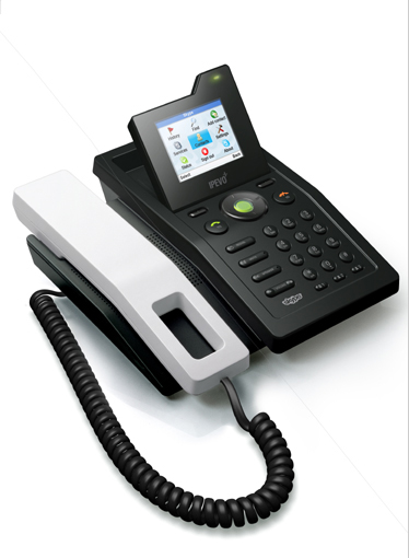
solo_3.jpgWe‘ve recently started using Skype hardware by little-known vendor IPEVO. SOLO models for the desktop (pictured) and FREE.2 USB handsets for the road. The SOLO plugs straight into your ethernet network, and also functions as a tiny ethernet switch, providing a port for your computer if you only have one RJ-45 jack at your desk. It took me less than 5 minutes to get running with no “Quick Start Guide” crap or drivers required. Since I already had a fully juiced Skype account, the SOLO logged in flawlessly with no hassle. Happiness ensued.

The full-color screen is easy to read and the angle can be adjusted. Unlike more “enterprisey” phones, there is no excess buttonage, and the unit in general is very easy to figure out and use. Despite a couple minor nitpicky items (could be easier to access voicemail, not enough speed-dial stuff, needs conferencing built in), the SOLO is a solid practical phone at less than $200 (USD) per seat.

I’m less fond of the FREE.2. I suppose it works well for what it is, but I don’t like having to think about starting special software to take advantage of all the features. Everything should Just Work without having to worry about additional moving parts. (Oh, and everything should integrate flawlessly with Address Book too.) The hardware itself seems to work well enough, but until the software side is more streamlined and polished I’ll likely stick to headphones and the MacBook Pros built-in microphone.

IPEVO also offers a dedicated conference unit named XING which we may pick up in the future, but have not played with so far.

Categories
computer

Small Office VoIP: Skype Pros/Cons

skype_logo.pngBefore the 2007 tax year ended, OpenRain decided to finally solidify a telephony strategy for the next year or so. Key requirements were..

  • Easy ad-hoc and scheduled conferences.
  • Mobile flexibility and continuity across physical locations.
  • Scalability for the next couple years.
  • Voice mail
  • Call forwarding.
  • Little to no management overhead. (I don’t want to run a dedicated PBX.)
  • Usable hardware.
  • Practical prices for worldwide incoming/outgoing calls.
  • Less than ~$2K initial investment.

It came down to one of two primary directions..

  1. Hosted VoIP (such as with Vonage or Qwest) with SIP phones such as from Cisco or Avaya.
  2. Skype with 3rd-party hardware and Mac soft-phone.

After some debate, we chose to use Skype exclusively for services, and have been fairly satisfied. I have a few beefs, but at less than $100 per year per person, I can’t complain too much.

Skype Pros:

  • Instant gratification. Easy to set yourself up for calls to/from landlines.
  • Good soft-client with videoconferencing support; Address Book.app integration is present in the latest Mac beta client.
  • Inexpensive. Less than $100 per seat per year for SkypePro and SkypeIn (an incoming number).
  • Awesome value when bundled with an IPEVO SOLO.
  • Extremely simple web interface for distributing company credits.
  • Concurrent logins from multiple locations. I leave my SOLO on 24/7 and use the soft-client on the road.
  • Great quality on Skype-to-Skype calls. Good quality to landlines.

Skype Cons:

  • My biggest gripe: In the U.S., outgoing calls do NOT show your SkypeIn number on the recipients phone.
  • Vendor lock-in, since Skype uses a proprietary protocol. Since cost of entry for services is so low, however, it may not be a huge deal if your want to switch to a SIP-based provider.
  • The WiFi-Phones all suck. The IPEVO SOLO is the only desktop model I like.
  • Possible future screwage of SkypeIn numbers if they ever change.
  • No 911, which is a general issue with VoIP services.